Showing posts with label maps. Show all posts

Friday, February 13, 2026

My Attempt to Map a Historic Itinerary

Historic newspapers can be illuminating but also frustrating.  A case in point is the series of articles in the 1864 Arizona Miner detailing "Woolsey's Expedition" in March and April of that year.  

I hoped to deduce some of the actual places visited by the expedition, but the details given were confusing, contradictory, and ultimately insufficient to definitively map where the events took place.  I wonder how many modern newspaper stories, when subject to the same analysis, would fall short?

I analyzed Henry Clifton's account from the May 11, 1864 issue.  The first step was to break the narrative into a numbered itinerary.  I underlined what I thought would be helpful clues, and bolded descriptions I thought would be interesting to compare against present day conditions:


My next step was to try to map the itinerary points on a modern day map.  I added two additionally pieces of information to the text.  First, I looked up that sunrise and sunset were at 6:20am and 6:50pm, respectively. This helps fill in the times for each stop.  Then I filled in the mileage between each stop.  
In the table that follows, question marks indicate uncertainty.  The start and stop points correspond to the itinerary above.


In some cases Clifton gives the mileage, and in some cases the stops can be determined so the mileage can be measured, but in many cases he does not give the mileage.  However, based on the travel and rest times I tried to estimate the mileage.  This can also be constrained by the possible stop locations.  For example, when they stop at a creek or a canyon, there are only so many choices for where that could be.  

This map shows their possible itinerary from Woolsey's ranch to the Apache Rancheria on "Squaw Creek".  Tent icons are campsites and hiking figures are other stops.  

Overview map showing likely itinerary points.

Waypoint #4 makes sense if they followed the drainage downstream from "Cottonwood Spring" SE to the next main drainage that could be described as "east fork of the Aqua Fria".  This fork is now known as Ash Creek.  The "Ash Creek" they named at stop #5 is most likely the next major creek to the SE, which is now known as Little Ash Creek.

My best guesses for stop #4 and stop #5.

Many mysteries remain.  First, they claim to do a lot of hiking at night, but this is extremely rough terrain that would be difficult to navigate by night.  According to the US Naval Observatory historical moon phase calculator, this expedition occurred during the waning last quarter of the moon, so they would not have had much light from the moon.  I don't know what kind of lanterns they had, but they don't describe much difficulty traveling at night, other than a description that they had to "descend carefully" to a creek for stop #7.

At stop #6, which occurred sometime after 10 PM on the night of March 31st, Clifton reports finding species of the garlic family on a ridge.  These small plants seem like they would have been difficult to notice by lantern light.  Interestingly, there are only two species of garlic/onions that grow in this area in the spring now.  One, is Crowpoison, which as the name suggests is toxic.  The other is Largeflower onion, which is not common.  

Second, was the Apache Rancheria at modern Squaw Creek or some other location?  It would make sense that their place name stuck, but Squaw Creek is not exactly a unique name so it is possible that other locations have the same name.  Interestingly these creeks that form the southeast boundary of Perry Mesa have been 
recently renamed Ledni Lii Creek, Gosga Creek, Liya Draw, Che Yagoodiguhn Creek, etc.  I can't find any information about when they were renamed or what the new names mean.

Based on their travel that night from 10 PM until 9 AM and their progress on other legs of the journey, I estimated that they traveled about 10 miles to get there.  However, (for reasons discussed below) I think the site of the Rancheria must have been just upstream of the confluence of Gosga creek and Ilya Draw (AKA North Squaw Creek and Squaw Creek), and this would put them less than 7 miles from camp.  After attacking the Rancheria they managed to get back to camp in less time, so it is possible that they were less than 10 miles from camp.   

Possible site of the Ranchera, upstream of the confluence of Gosga creek and Ilya Draw (AKA North Squaw Creek and Squaw Creek)

In the description of the battle, Clifton states that Company C was west of Company B.  Company B "was in the canon below the rancheria" and chased the Indians up the canyon to where company C was.  Since almost all of the canyons in this part of Arizona run from NE to SW, I had a lot of trouble finding a location where "up canyon" was some westerly.  

Conclusion

Through this exercise of interpreting and attempting to map a historical itinerary, I've come to realize the difficulty of matching newspaper accounts to specific locations.  Without an extremely explicit travelogue, creating a location-based itinerary is either impossible or unreliable.  There were several times when I was ready to give up, but through persevering, rereading the account, and staring at the map I've at least been able to convince myself that some of these locations are approximately correct.  I hope to visit some of these areas in the coming months to retrace the route and add additional information.  

Notes

Note: #PrescottAZHistory blog has an account of Woolsey's expedition that is more of a summary and less of a GIS analysis.  

Note 2: Woolsey organized several expeditions, including a second one in June of 1864 that traversed a much larger area.

Monday, July 15, 2024

The case for using geography to understand phenology

 Alexandra Permar and Conor Flynn collaborated on this project.

Calochortus is an astonishingly diverse genus of flowering monocots, with common names that include Mariposa lily, Sego lily, and globe lily, as well as pussy ears, fairy-lantern, star-tulip, and others.  Their center of diversity is in CA, which has 48 out of the 78 total species in the genus.  In Arizona, there are 6 species, ranging in color from white, to pink, to yellow, and sometimes orange, with diagnostic darker markings on the inner base of the petals.  


    This genus in Arizona makes an interesting case study of biogeography and phenology because each species occurs in a relatively distinct (but overlapping) elevation and geographic location.  Also, because the flowers are very showy, there are more than 2,400 Research-grade observations documented on iNaturalist.   

    The plant grows quickly from underground tubers in the spring, flowers quickly, and then dies back; the growing stem and then the seed heads are relatively inconspicuous and are rarely photographed.  This means that almost all of the iNaturalist observations are of the flowers, which makes studying the phenology easier because there is less work needed to annotate images as flowering or not flowering.  Nevertheless, we still reviewed observations and annotated and removed any photographs that didn't show flowers from the phenology analysis below.  

Methods 
Research-grade Calochortus observations in AZ were exported from iNaturalist and processed in Excel and graphed in Excel and Tableau.  iNaturalist Research-grade observations are used for research, but observations with inaccurate locations can lead to misleading analyses and must be removed.  
A total of 2350 observations were exported.  Taxa were classified by species (even though subspecies IDs exist for several hundred observations).  Cleaned records with geopositional accuracy > 1000 m (excluding blanks; there are 594 blanks).  Removed 61 records with geoprivacy obscured. (In iNaturalist, obscured geoprivacy impacts the geopositional accuracy of an observation to +/- 500 square kilometers.)  8 observations were noted as not flowering and were removed from analysis.  After cleaning, the database contained 2066 records (observations).  This shows that about 88% had location precision that met our inclusion criteria.


 Calochortus kennedyi had the most observations (782),  C. ambiguus and C. flexuosus tied for 2nd most observations (534), while C. aureus (148) and C. nuttallii (61) had the least number of observations. 

Geocoding Elevation
iNaturalist does not record elevation of observations, so it is necessary to intersect the observation points with a Digital Elevation Model in GIS.  Observations were added to ArcGIS Pro and displayed using their XY coordinates.  Connect to elevation in Esri AGOL Living Atlas : Ground Surface Elevation - 30m (image service / raster DEM).  Use Geoprocessing tool Extract Multi Values to Points ( Need Spatial Analyst license).  Copy resulting data back to excel. 
        Tableau Public was used to graph data.  Calochortus Bio-Geo-Phenology | Tableau Public

Results: Biogeography and Elevation
    Ordered by average elevation, Calochortus kennedyi and C. flexuosus are the lowest elevation species, C. aureus, C. ambiguus, and C. nuttalli occur at middle elevations, and C. gunnisonnii occurs at the highest elevations.  


C. kennedy (blue) is clearly visible at lower elevations along the foothills of the AZ mountains, and then extends to the West beyond the distribution of any other species.  C. flexuosus (green) is also visible to the NW of AZ, extending through central AZ in the lower elevation valleys of the Verde, Salt, and Gila rivers.  C. gunnisonnii (purple) is clearly visible in Colorado, barely extending down to the high country in AZ.  C. aureus (pink) stakes out a unique territory on the Navajo nation in NE AZ and SE Utah. C. ambiguus (red) is found throughout the mountains and high country of AZ.  


 Graphing both latitude and elevation help to illustrate this biogeographic comparison.  In the graph below, it can be seen that C. kennedyi is the most southerly of our Calochortus, and occurs at the lowest elevations.  C. flexuosus occurs farther north, but also at low elevations.  C. ambiguus marks out a consistent territory at higher elevations than other species, depending on elevation. Gunnisonii is a clear outlier, occuring only at high elevation in our study area.  There is a fair amount of overlap between C. aureus and C. nuttallii.
        This biogeographic comparison can help differentiate similar-looking species.  There are 4 white Calochortus in AZ.  C. gunnisonni is clearly only a high elevation species, although C. ambiguous can also occur at high elevations.  In the northern part of the state, C. flexulosus occurs at lower elevations, C. nuttallii at middle elevations, and C. ambiguous only occurs at the highest elevations. 


Results: Phenology
Overall, for Calochortus species in AZ, flowering begins at low elevations around week 13 (last week of March) and progresses to higher elevations, generally wrapping up around week 29 (third week of July).  Flowering species composition changes from C. flexuosus and C. kennedyi to C. ambiguus, with C. aureus and C. nuttalli thrown into the mix.  C. gunnisonni (barely visible at the far upper right) is, of course, the last to flower.  This chart also highlights how C. aureus is mainly restricted to 1600-1800 meters ( 5200-5900 feet).  


    Calochortus ambiguus shows the strongest relationship between elevation, latitude, and flowering date.  Based on this scatterplot, we were able to confirm that the location is not accurate for the observation at the far left side of the plot. 


Calochortus kennedyi, C. aureus, and C. flexulosus do not show as strong of a pattern, and C. gunnisonnii did not have enough observations in AZ to analyze.  
Example of C. kennedyi:


Graphing flowering week of C. kennedyi separately for Latitude and for elevation shows that there is some pattern, but it is clearly quite week.  The R squared values for these charts are 0.22 and 0.12.  Interesting, it looks like flowering actually starts at middle elevations (around week 11), then flowers appear at lower and higher elevations (week 16), until finally only the higher elevations are still flowering (week 20).  C. aureus and C. flexulosus show somewhat similar patterns (data not shown).  

Discussion
    There are many possible ecological and data collection reasons for weak r values:
1) Micro-site variation: south-facing aspect may have more impact than elevation.  Whether a site is forested, if there are shadows from cliffs, etc.
2) Genetic variation:  if a single species showed up with 2 distinct populations, that would be evidence for possible speciation or subspecies, but all populations showed continuous variation.  There may still be genetic variation between meta populations, or within single individuals.
3) Flowering period not known: our records only show flowering presence, not the start of flowering or the total period of flowering.  Correlations might be better if we had complete data, but our data is not complete: we only have point observations.  For example, if species A flowers from April 1-30 and Species B flowers from April 28-May 28, a visitor on April 28 would record both species as flowering at the same time, even though they do have distinct flowering periods.  

Friday, May 17, 2024

How to Estimate Emissions from Land Use Change

This blog post highlights the valuable role played by GIS layers in planning and complying with upcoming GHG reporting standards. New protocols will classify carbon released from land use changes as Scope 1 emissions, requiring stricter tracking.

There are several GIS layers (reviewed below) that can be used to estimate potential carbon emissions from biomass and soil carbon losses due to land development projects. While these layers may not be suitable for final reporting, they can be valuable for:

  • Strategic planning: Identifying areas with high potential emissions and prioritizing mitigation efforts.
  • Impact Assessment: Estimating the range of carbon emissions from projects.

These GIS layers, available in Esri's ArcGIS Online Living Atlas, have the potential to improve the ability of large businesses to plan for and comply with upcoming regulations related to land use change emissions.

UNEP Above and Below Ground Biomass Carbon 

Two datasets represent above- and below-ground terrestrial carbon storage (tonnes (t) of C per hectare (ha)) for the entire globe (2010).  The first layer layer estimates total biomass (i.e. plant parts such as roots, leaves, trunks) whereas the second layer includes soil organic carbon (SOC) and is therefore weighted to show the contribution of peat and permafrost-contained regions.  Both layers support direct analysis in GIS software.    

Left: First dataset shows plant biomass with large concentrations of C in the world's forests.  Right: Second dataset includes SOC and shows the large amounts of C in the world's arctic peat and permafrost.

USFS Predominant Major Forest Carbon Pools of the Continental United States

This layer layer depicts the predominant major forest carbon (short tons per pixel) pools of the Continental United States. The layer used USFS Forest Inventory & Analysis plot data and Landsat 8 Operational Land Imager scenes as inputs to an ecological climate model to estimate Live, Dead, and Organic Soil carbon pools.  However, the data is somewhat difficult to analyze because each pool is in separate raster image bands, and because the metric reported is short tons per pixel, where the pixel size varies across the map based on Web Mercator projection.  

USFS offers a faster and easier to use layer called CONUS Total Forest Carbon 2018, which provides short tons Carbon per pixel summed across all 8 individual carbon pools.  

Around Prescott, AZ the pixel size is 80 by 80 ft, so each pixel value must be multiplied by 6.8 to get tons per acre.  It looks like most of the pixels show a carbon pool of 30-36 tons/acre in this area.

To compare this layer with the UN layers mentioned above, it is necessary to convert US tons to metric tons and acres to hectares.  Overall this yields a correction factor of 2.24 to get from tons/acre to metric tons/hectare.  This yields a range of 67-80 metric tons/hectare carbon based on the USFS layer.  The UN Total Biomass layer estimates anywhere from 38-50 metric tons/hectare, while the UN layer that adds in SOC estimates 120-160 metric tons/hectare.  It seems that the USFS map estimates carbon pools in between these two ranges.

Northern AZ pine forests viewed in the USFS Forest Carbon layer.  It is not always clear how to interpret this data.

Thursday, April 18, 2024

Spring Update: NDVI Differences

Last September, I wrote about Finding the Greenest Place in AZ.  This Spring, we have continued to compare and evaluate the different NDVI difference mapping applications and compare them to the actual growth of wildflowers and grasses we see when we go out hiking.  

Methods

I conduct pre-field research to identify predicted greenness/moisture from UA's Droughtview, USGS VegDRI, and NWS Accumulated Precipitation.  I take a screenshot of each product and assign the proposed site a scale from 1 (driest) to 10 (greenest).  We then visit the area and evaluate the plant production, recording example photos of overall landscape greenness, as well as assigning a score.  The data are organized in a OneNote table.  I then compare the numerical scores in an excel table, adding up the differences between each model and the observations.  


Results

So far, the UA model seems to slightly overestimate greenness, the USGS model greatly underestimates greenness, and the NWS precipitation record comes out closest to observation.

For the UA model, I think it might be helpful to have a difference from maximum, instead of the difference from period. The latter overestimates early spring greenness when the denominator NDVI is very small, so any amount of NDVI in the numerator saturates the index.  Using the maximum NDVI for that pixel could help with this phenology issue.  Plus, % of maximum NDVI may be more intuitive than “difference from average”.

The USGS VegDRI index consistently estimates pre-drought to severe drought in areas that have above average precipitation this water year and have an NDVI above average.  This leads me to think that VegDRI 7-Day eVIIRS is either not well calibrated to the desert southwest, or perhaps that it is better used as a predictive index – perhaps these areas are drying out even though they currently appear green?  However, SWCC does not show significant vegetation drying yet in the areas I assessed.  


Examples

Wingfield Mesa:  UA Droughtview shows this area at maximum NDVI (for this time of year)(=10/10), USGS showed it as pre-drought to moderate drought (4/10) , and NWS shows 125-200% of normal year to date precipitation (9/10).  It is quite green, but it is still early in the growing season and the mesquite have not leafed out yet.  We rated it 6 out of 10.  


Dugas Rd:  UA shows above average (8/10), while USGS showed Moderate drought (3.5/10) and NWS showed slightly below average precipitation (75-90%) (3.5/10).  It is quite green right now, but again not quite at maximum greenness production.  We rated it 8 out of 10.   

Tuesday, May 16, 2023

Biodiversity in the United States

Summary

NatureServe's Map of Biodiversity Importance (MoBI) is actually 4 main maps and 53 supporting maps.

The four maps showcase different aspects of biodiversity in the United States using Geographic Information System (GIS) technology. The maps are all based on data from NatureServe, which aims to assess the status and distribution of biodiversity across the United States. Each map uses a different metric to measure biodiversity and provides valuable insights into different facets of the complex and multifaceted concept of biodiversity. These maps can be used to inform conservation efforts and guide land use decisions to protect and preserve biodiversity in different regions of the United States. However, it is important to note that each map provides a limited view of biodiversity, and a comprehensive understanding of biodiversity requires consideration of multiple factors and metrics.

For example, it is difficult to determine which map shows the highest biodiversity in Arizona because each map uses a different definition of biodiversity. Map #1 shows the richness of imperiled species in the United States, but does not provide a total biodiversity count. The highest value in Arizona for this map is 11. Map #2 shows the summed range-size rarity of imperiled species in the United States, which measures the presence of imperiled species with small ranges, but does not necessarily capture total biodiversity. Maps #3 and #4 focus on areas of under-protected biodiversity importance of imperiled species and may not be as useful in determining total biodiversity.  It would be helpful to have a map that shows the total biodiversity of an ecoregion, which is not captured by any of these maps.

More resources

MoBI ESRI Overview

 Story map 

YouTube The Map of Biodiversity Importance | Dr. Healy Hamilton's Presentation at 2020 Esri UC

Detailed notes on each map

Map #1: Richness of Imperiled Species in the United States

1) Richness of Imperiled Species in the United States: link

a. High values identify areas where more imperiled species are most likely to occur.

b. Richness values are simply a tally of the number of species with habitat overlapping a cell.

c. Values range from 0 to 31, but the color ramp maxes out at 11.  

a. Highest value in AZ is 11.

b. Tenneessee has highest value upstream of Chattanooga and Knoxville along the Clinch river in the Cumberland river valley.

d. This is the prettiest map and easiest to interpret.

e. Most of the Sonoran desert has 0 imperiled species?  What about Pygmy owls?Sandhills east of Carlsbad only have 1 imperiled species (lesser prairie chicken).  What about lizards?  What about rare plants?


Map #2: Summed Range-size Rarity of Imperiled Species in the United States

2) Summed Range-size Rarity of Imperiled Species in the United States:  link
a. High values identify areas where species with very small ranges (and thus fewer places where they can be conserved) are likely to occur; the presence of multiple imperiled species contributes to higher scores.
b. Range-size rarity for each species is the inverse of the total area mapped as habitat. Summed range-size rarity is the sum of the range-size rarity values for all species with habitat that overlaps a cell.
c. The range for RSR values in cells containing species habitat is 0.0000002784 to 1.44584. A single species can have a value as high as 1.020335, which means just one 990-m cell contains all habitat for that species.  The RSR score for a species with habitat in two 990-m cells is 0.510167. 
d. This map is probably most important for conservation, and because its harder to interpret maybe is easier to use…less questions!

 Map #3: Protection-weighted Range-size Rarity of Imperiled Species in the United States


3) Protection-weighted Range-size Rarity of Imperiled Species in the United States: Link
a. High values identify areas where more unprotected, restricted-range species are likely to occur.  
b. Weighted based on how much of range is in protected areas.
c.  Each species was assigned a PWRSR score equal to the product of range-size rarity and the percent of habitat that is unprotected. The PWRSR raster sums these scores for all species with habitat that overlaps a cell.
d. Note:  Data based on USGS "GAP" analysis.  "Protected areas" include Wilderness and National Monument (GAP 1 and 2), but not Federal lands open to extraction like National Forests and BLM (GAP 3). 

Map #4: Areas of Unprotected Biodiversity Importance of Imperiled Species in the United States 


4)  Areas of Unprotected Biodiversity Importance of Imperiled Species in the United States: link
a. Values of “1” identify areas where under-protected and range-restricted species are most likely to occur, including areas where the presence of multiple imperiled species contributes to higher scores
b. This is the same as #3 above, but with a cutoff value to make the map black and white.
c. AUBIs (Areas of unprotected biodiversity importance)

Thursday, September 22, 2022

Mapping Species Habitat with Appropriate-Sized Buffers

 Previously, I wrote that this Story Map shows small polygons of habitat as buffers around representative observations.  However, the actual locations are not accurate because the underlying observation data has been randomized to protect populations of rare species. 


The first map ("Preliminary Conservation Zones" and "Potential Dispersal Zones" for the American, Rusty-patched, Suckley's, and Western bumble bees) shows the correct kind of critical habitat (buffered observations) USFWS has designated for rusty patch and would likely designate for other proposed species, but the locations are incorrect.  For example, the mapped locations of Rusty patch on that map do not line up to the USFWS GIS for rusty patch critical habitat. 


Some of the other species may be are incorrect as well, depending on whether the data source (GBIF) considers the species endangered and so randomized the locations within a 0.2 degree lat/long box.  That seems to be the case for the Western Bumble bee, but not the American bumble bee. 


The map shows a mix of accurate and inaccurate, specific habitat points. This is confusing and potentially misleading, if the intent is to facilitate conservation planning.  For example, when I zoom to an area of interest, I might think there is no mapped habitat there. But if there is some nearby, I can't tell from if that habitat is or isn’t within my area of interest.


The easiest fix would be to increase the size of the buffers so that they include the entire randomized area (0.2 degree, lat/long) that each point comes from.  A note could say that critical habitat would likely be designated in a subset of those larger polygons based on the buffer size USFWS decides.

Monday, September 19, 2022

Rusty Patched Bumble Bee Critical Habitat


Rusty patched bumble bee range map.

USFWS listed the rusty patched bumble bee (Bombus affinis) as Endangered in 2017 due to a marked decrease in the range and size of populations across the Eastern U.S.  

As one of the first insect species to be listed under the Endangered Species Act, it offers an interesting case study for the way USFWS may approach other insects proposed for listing, including the Monarch butterfly, and numerous other bumble bee species.

From Xerces Society Listing Petition, 2016.

The listing petition states that "the rusty patched bumble bee probably needs floral resources to be located in relative close proximity to its nest sites, as studies of other bumble bee species indicate that they routinely forage within less than one kilometer from their nests ... although in some cases nearly two kilometers ... [It] is likely dependent upon woodland spring ephemeral flowers, since this bumble bee emerges early in the year and is associated with woodland habitats.....Rusty patched bumble bee queens are one of the earliest species to emerge, with observations as early as March and April."

Interestingly, rather than designate critical habitat based on the habitat needs of the species, USFWS chose to designate "High Potential" zones (e.g. critical habitat) as 1 mile buffers, and "Low Potential" zones as 4 mile buffers, around known (since 2006) sightings of the rusty patched bumble bee:


USFWS Map showing "High Potential" and "Low Potential" zones.  


Detail showing example 2x2 mile rusty patched bumble bee "High Priority" habitat in DeKalb, IL from USFWS map.  The buffered area seems to be based on a sighting at Prairie Park, and includes residential and industrial developments.  The only habitat in the area is within Prairie Park.  


USFWS has issued the guidance on whether consultation is required.  For vegetation management activities within the High Potential zones, the guidance provides the following test questions:
  • Is there habitat for nesting, foraging, and/or overwintering for the rusty patched bumble bee in the action area or will the proposed action restore habitat for the species in the action area? 
  • Will the action cause effects to vegetation in rusty patched bumble bee habitat in the High Potential Zone during the nesting period? Effects could occur as a result of mowing, cutting, grazing, prescribed fire, tree removal, spot-application of herbicide, tree clearing, and/or other activities. 

Based on this case example, it seems likely that USFWS will take a similar approach when listing other bumble bee species.  Specifically, it seems likely USFWS will only designate habitat immediately surrounding recently documented sightings, as opposed to using a general habitat model across the species' range.  Then, Section 7 consultation will be required for any activities that disturb habitat during the nesting period (i.e. growing season).

This seems to be the assumption underlying this Story Map, which shows small polygons of habitat as buffers around representative observations.  Note that the actual locations in this map are not accurate because the underlying observation data has been randomized to protect populations of rare species. 

This map of rusty patched bumble bee habitat around DeKalb, IL schematically shows the kind of habitat USFWS designated (i.e. buffered polygons around point observations) but does not show the accurate locations of the habitat because the data used for the map (GBIF) is randomized within 0.2 by 0.2 latitude/longitude rectangles.  

Tuesday, January 11, 2022

Phenology, Accumulated Growing Degree Days, and Soil Moisture

US Crop Calendar

Source: https://ipad.fas.usda.gov/countrysummary/Default.aspx?id=US


Arizona had a good year for NDVI

Source: https://glam1.gsfc.nasa.gov/


NASA SMAP data.  Data is global.


This mapped layer is delayed by 2 weeks.  I haven't found a layer that shows real-time moisture.


NPN Visualization tool can view Historical, Current, and Anomaly Accumulated Growing Degree Days. Data is only for USA.

Source: https://data.usanpn.org/vis-tool/#/explore-phenological-findings


Friday, October 02, 2015

2015 Summer Monsoon Totals


The NWS maintains a report of monsoon totals for the ABQ metro area.
Percent of normal monsoon moisture received in July, August, and September 2015.

Moisture during the summer was spotty, but usually above average.

Thursday, March 05, 2015

Predicting Plant Phenology

Plants in the Southwestern deserts respond to water availability and temperature:
Map from AHPS Precipitation Analysis from January and February
NM is doing good on water so far this year!
Growing degree day map from PNWPest.org
On average NM is about 6 growind degree days (GDD) behind 2014, but 11 days ahead of 2013 and 6 days ahead of normal.

Saturday, February 14, 2015

Permian / Delaware Basin Maps


BLM Land Ownership:


GAP Landcover data for SE NM from the Webviewer. Version 2.0 is available here. Lime green is Sandhill Shrubland mixed in with light green Chihuahan Semi-Desert Grassland.  Lavender is Mesquite Shrubland (AKA degraded grassland).  Orange is Great Plains Shortgrass Prairie.  Teal is Chihuahan Desert Scrub.  Detailed descriptions of the landcover classes are available (PDF):  Landcover descriptions for the southwest regional GAP analysis project. Compiled by NatureServe 10 September, 2004.  

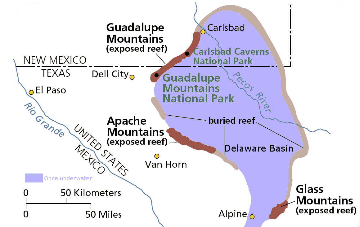
Geology of the basin:  (Click here for more info on the geology of the Guadalupe Mountains)

Monday, September 15, 2014

A streamlined, GIS version of USDA's Environmental Benefits Index

USDA calculates the environmental benefits of applying conservation easements to farmland.  The University of Minnesota has developed an online tool for mapping three important components used by decision-makers to prioritize farmland conservation funding:

Soil loss is calculated using the Universal Soil Loss Equation, which factors in slope angle and distance, soil texture,

Water quality risk was calculated using a Stream Power Index, and proximity of land parcels to streams.

Habitat quality was calculated using by intersecting known stressors such as roads and development with known areas of high quality habitat, such as areas with endemic or endangered species, high biodiversity, and/or high game abundance.

The combined metric for all three layers generates the Environmental Benefits Index.
Screenshot from maptool from the EBI page of the Natural Resources Research Institute at the University of Minnesota.


Tuesday, February 04, 2014

Passion-flower Distribution in the Sonoran Ecoregion

Source: SEINet


Passiflora (Passion flower vine) is a tropical genera of vines, which reach their northernmost distribution with P. mexicana in the Santa Teresa mountains, North of the Gila River.  They produce edible passion fruits, but the herbiage is extremely unpalatable to animals, to the point that (reportedly) starving horses will not eat P. foetidius due to the stinky sticky hairs.
I have never seen these monsoon-bloomers in the wild in Arizona, but hope springs eternal in the Sky Islands...there are three species in Arizona:  P. arizonica, P. bryonoides, and P. mexicana:


P. arizonica ca 4-5.5 cm in diameter, whitish, the corona white or purplish.


P. bryonioides ca. 2.5-4.5 cm in diameter, whitish with purplish bands on corona. 


P. mexicana ca. 2-3 cm in diameter, light green or yellowish green, the corona red or reddish purple.

There are two more species in the Sonoran Desert south of the border:

P. palmeri (no description available)


P. suberosa (no description available)