Showing posts with label map. Show all posts

Tuesday, July 30, 2024

How to Use Satellites to Find Growing Plants: A Practical and Theoretical Guide


USGS Maximum consecutive dry days, July 2024


Introduction

Knowing where and when plants are green and growing would help botanists and ecologists plan field work and help managers make real-time land management decisions.  There are many potential sources of geospatial data available but it is difficult to know which sources are most useful.

Over the past year I evaluated the accuracy and interpretability of dozens of indicators that could be used to assess current growing conditions.  These websites, maps, and data layers are mainly provided by US Government agencies to help managers respond to natural resource concerns such as rangeland management and drought impacts.

In my opinion, none of the available resources is a perfect fit to find growing plants.  However, understanding how plant growth is related to biophysical constraints can help identify the best available resources.


Plant Growth Theory

Plant growth (Net Primary Productivity, NPP), is proportional to total soil moisture (SM) and Growing Degree Days (GDD) of accumulated Temperature (T) since the start of that plant's growing season.  Soil moisture depends upon accumulated (total and frequency of ) precipitation (P) minus evapotranspiration (ET).  

 NPP = Sum (SM*T)

 SM = Sum (P-ET)

[In the above equations, "equals" is used to mean proportional, or depends upon. ]

The ideal resource for plant growth would be a direct measurement of NPP.  A second option would be measurement of soil moisture and temperature, with a way of combining them to estimate NPP.  A third option would be measurement of precipitation, which could be used to estimate SM. All of these variables can be measured via satellite, but delays make them difficult to use in real time.  Also, there are important details in how they are measured and modelled that make interpretation difficult.  


Details

Plant Growth: satellites can measure NPP via NDVI (Normalized Difference Vegetation Index), but available sources are delayed (DroughtView), low-resolution (GIMMS), weighted toward trees, and contain artefacts early in the growing season.  Existing models of NPP are not well-calibrated (VegDRI), or delayed and not mapped (RAP).

Soil Moisture: satellites can measure SM, but satellite data (SMAP) is not consistently available, may be inaccurate, and only provides a snapshot, not the sum.  Models of SM are not well-calibrated (NASA LIS).

Temperature: sensor networks can measure T and calculate Growing Degree Days (NPN) but aspect and micro variation are often more important than county-level temperatures.  This is helpful early in the growing season.  

Precipitation: radar and rain gauge networks can measure P and are timely and accurate.  Maps of accumulated P are available from NOAA and number of days with/without rain in the last month from USGS.  However, because P is not a direct measure of NPP, this can only be a general guide to plant growth.  


Conclusions

P - Best. Note that both total and frequency matter.

SM - not available.

T - GDD is helpful in Spring phenology, but don't matter later in the season.

NPP - difficult to use.  Good for viewing thinning and forest fires, not very helpful for spotting wildflower growth or distinguishing between grass and tree green-up.  


NOAA precipitation accumulation as percent of normal for July, 2024

Practical How-To

I recommend using a balance-of-evidence approach that combines the two best sources of precipitation information, NOAA for total accumulation, and USGS for frequency.  If both sources show good precipitation during the recent growing season, there is a good chance that plants are growing well in response to abundant and regular moisture. 

NOAA's National Water Prediction Service provides accumulated precipitation over any time period from 2005-present with less than 24 hour delay.  Their web viewer is currently the only way I know to view this data because I don't have the programming skills to use their API.  

Scroll down to Precipitation Estimate, where it is possible to set the time period of interest and map Precipitation in terms of Observed (totals), Normal (average), Departure from Normal (inches more/less than normal), and Percent of Normal.  The map is sometimes glitchy depending on connection speed.  More details about how precipitation is calculated are available in the help guide.  Note that this map is usually up to date for the previous "water day" ending in the early morning (so for AZ, selecting "Today" shows precipitation that occurred yesterday through 7 am today).

USGS's Drought Monitor provides access to several precipitation metrics, with a 48 hour delay. To assess precipitation frequency/regularity, I use Maximum Consecutive Dry Days (Past 30 days) and Days Since Precipitation.  They also offer total accumulated precipitation over the last 7 and 30 days (again, with a 2 day delay).  Their web-viewer is clunky and hard to use, but it is easily available.  Double click on the Dataset of interest in the left pane and resize the resulting window to view the area of interest.  The layers have no opacity, so to view the underlying map they have to be checked on/off in the Layers pane.  

They also make their data available as WMS that can be added to any ArcGIS desktop or online map.  The opacity can be adjusted on the Group layer that is created after the data is mapped.  However, the time-enabled settings can be difficult to use, and I haven't figured out how to show the data time period.  The web viewer is easier to change the time period and to see the data date range.

Note that USGS Drought Monitor also provides VegDRI and QuickDRI, two models that claim to incorporate all of the biophysical variables listed above (and then some!) to model NDVI difference from average.  These models are extremely complex, but they don't seem well-calibrated to Arizona because I have not found them to be very accurate or helpful.  

Friday, May 03, 2024

The Knife Edge of Spring

"To what purpose, April, do you return again?
Beauty is not enough.
You can no longer quiet me with the redness
Of little leaves opening stickily."

-from Spring by Edna St. Vincent Millay


In AZ, the spring green up of grasses and trees makes use of a narrow window of time between declining winter moisture and increasing summer heat.  Our redbud trees blooms for three or four days (this year, from April 26-29), the lilac bushes hardly last much longer, and the spring green up of weedy lawns is over by the end of May.  June is the dry season in Arizona.  June is when spring dies.


The knife edge of spring in Arizona can be seen in the biomass production.  For example, the Rangeland Analysis Platform shows that peak spring growth in Dugas, AZ in 2020 lasted approximately 3 weeks, from 4/1 to Earth Day 4/22.  By May, the growth of the annual green up was already in freefall.  More examples can be seen in this previous blog post using RAP to investigate biomass production variability from year to year.  


Phenology Mapping

The National Phenology Network's Visualization Tool can be used to follow the spring green up via Accumulated Growing Degree Days (AGDD), which work by adding up all of the days and temperatures above some minimum threshold for growth, usually 32 F for cool season plants (winter annuals, cool season grasses, willows and cottonwoods and other early spring plants) or 50 F for warm season plants (mesquite, acacia, and other warm season trees like Chilopsis, walnut, and warm season grasses and forbs).


AGDD Details
A "growing degree day" (GDD) is calculated by subtracting the threshold temperature (T) from the average temperature for each day when the minimum temperature is above the threshold temperature of 32 or 50 degrees. 

Average T = (Maximum T - Minimum T)  / 2

GDD = Average T - Threshold T

 Accumulated growing degree days (AGDD) simply adds up all of the GDD since the beginning of the year.

AGDD = GDD (January 1) + GDD (January 2) + … + GDD (yesterday)

To use the NPN Visualization Tool for AGDD, choose Map>Base Layer>Category: Daily temperature accumulations>Layer:Current Day.


AGDD Example - 32 F
The figure below shows AGDD around Prescott, AZ from a threshold temperature of 32 as 5/2/24.  Most of the map shows AGDD of about 2,000; since there have been about 120 days since the beginning of the year, that works out to an average daily temperature of 48 degrees F (2,000/120 + 32 =  48).  Of course, some areas have been warmer than that and some have been cooler:  


Phenology AGDD from 32 F 

1,600 - cottonwoods leafed out (Prescott)

1,800 - still winter grasses not green (Kirkland junction)

2,200 -  annual grasses very green, early spring wildflowers blooming (Dugas)

2,245 - mesquite not leafed out yet, annual grasses still somewhat green (Yava)

2,500 - mesquite leafed out, annual grasses brown (Date)

2,800 mesquite flowering (Congress)


AGDD Example 50 F
Or maybe a 50 degree threshold better shows mesquite and grass green up? The average daily temperatures, of course, are the same, but the different threshold yields much lower AGDDs, mostly in the low 100's.  On this map, light green area are grasses already brown and mesquite leafed out, green areas actually are green fields of annual grasses, whereas white and blue are areas where willows, cottonwoods, and elms have leafed out, but herbaceous plants are just barely getting started.


Phenology AGDD from 50 F 


240 - oaks turning brown (Kirkland)

350 - mesquite not greened up yet, annual grasses and forbs green (Dugas)

400 - mesquite not leafed out yet, annual grasses still somewhat green (Yava)

550 - mesquite leafed out, annual grasses brown (Date)

800 - mesquite flowering (Congress)


AGDD Anomalies
The examples above of specific phenology AGDD values can be used in conjunction with NPN's Visualization Tool to predict plant growth stage.  Also, it is possible to use NPN's Visualization Tool to highlight geographic areas that may be ahead or behind the usual spring green up using the "Anomaly" visualization.  In the figure below, anomaly from 32 F AGDD, it can be seen that the Kirkland valley, Black Canyon City, and the Verde valley are behind (blue) normal phenology, whereas Prescott valley and especially the area north of Bagdad are ahead (red) normal phenology.  


"Life in itself 
Is nothing,
An empty cup, a flight of uncarpeted stairs.
It is not enough that yearly, down this hill,
April
Comes like an idiot, babbling and strewing flowers."

-from Spring by Edna St. Vincent Millay


Tuesday, January 11, 2022

Phenology, Accumulated Growing Degree Days, and Soil Moisture

US Crop Calendar

Source: https://ipad.fas.usda.gov/countrysummary/Default.aspx?id=US


Arizona had a good year for NDVI

Source: https://glam1.gsfc.nasa.gov/


NASA SMAP data.  Data is global.


This mapped layer is delayed by 2 weeks.  I haven't found a layer that shows real-time moisture.


NPN Visualization tool can view Historical, Current, and Anomaly Accumulated Growing Degree Days. Data is only for USA.

Source: https://data.usanpn.org/vis-tool/#/explore-phenological-findings


Tuesday, September 28, 2021

2021 Arizona Monsoons

 It was a good monsoon in AZ this year, with some locations up 8 to 12 inches above normal (June-September 8).  But due to the uneven distribution of thunderstorms, even in this good year some areas barely received normal!


Friday, January 15, 2016

Why I Plan to Get the Seasonal Flu Vaccine Next Year

Introducing The Virus

Image of flu virus with antigen proteins on phospholipid(?) surface and RNA in the middle. From. http://www.cdc.gov/flu/professionals/laboratory/antigenic.htm. Tamiflu works by binding the purple neurominadse proteins. Tamiflu was developed from shikimic acid, which was originally available only as an extract of Chinese star anise but by 2006 30% of the supply was manufactured recombinantly in E. coli.[54][55]

Vaccine viruses are chosen (i.e., February for the Northern Hemisphere flu vaccine) because it takes 6-8 months to grow them in chicken eggs. Health officials would like to grow them in human(?) cell culture, but that it not currently allowed. Eggs are problematic because viruses may adapt to the egg.

"As a result, Immunologically naïve ferrets) are the most sensitive method available for detecting antigenic differences between influenza viruses."(from http://www.cdc.gov/flu/professionals/laboratory/antigenic.htm)

Evolution and Types of Virus

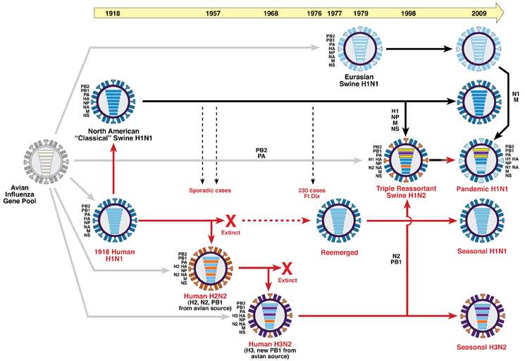
H3N2 (swine) flu and H1N1 (avian) flu are main lineages. Major outbreaks occur suddenly and unpredictably through transmission of new varieties from animal hosts. Seasonal (common) flus are derived from the same lineage, but generally evolve slowly and predictably. Each year, novel viruses make the leap from animal to human. For example, during the 2013–14 influenza season, one case of human infection with an new strain of H3N2v virus occurred in a child from Iowa with known direct exposure to swine. Birds seem to have co-evolved with the flu virus and do not mount an immune response to it. Therefore (luckily!) it appears to evolve much more slowly in resevoir species than in humans. This has important implications for the dynamics of seasonal and epidemic flu outbreaks.


Influenza A is the most common. It is highly likely that of all the seasonal influenza strains circulating at the present, one of them will multiply and give rise to the entire seasonal influenza populations in around 5 years. The descendants of all other viruses will most likely be extinct.


For example, the 2014–15 influenza vaccines used in the United States have the same antigenic composition as those used in 2013–14. The trivalent vaccines should contain an A/California/7/2009-like (2009 H1N1) virus, an A/Texas/50/2012-like (H3N2) virus, and a B/Massachusetts/2/2012-like (B/Yamagata lineage) virus. (http://www.medscape.com/viewarticle/826572_6)

The lineage of evolutionarily successful viruses is usually termed the trunk of H3N2 influenza’s evolutionary treea:


The tree is based on hemagluttin protein sequence evolution, colored according to estimated geographic location, indicating high permanence of the trunk in China and Southeast Asia. The genetic changes occur on the neuroamidase and hemoagglutin virus surface proteins, causing antigenic drift. The truck of the H3N3 tree with a single dominant lineage contrasts with more branching trees of other flu types where different varieties often co-circulate, such as H1N1, and Influenza B and C. This graph and these findings are complicated by whole-genome sequencing: a new graph shows overall viral genome evolution in The evolution of epidemic influenza by Martha I. Nelson and Edward C. Holmes Nature Reviews.
Figure courtesy of Lemey P, Rambaut A, Bedford T, Faria N, Bielejec F, et al. http://theglobalscientist.com/2014/11/03/what-can-data-science-tell-us-about-influenza/


Current Trends - CDC FluNet


http://www.cdc.gov/flu/weekly/


Is flu increasing...

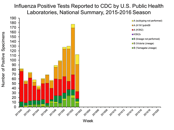
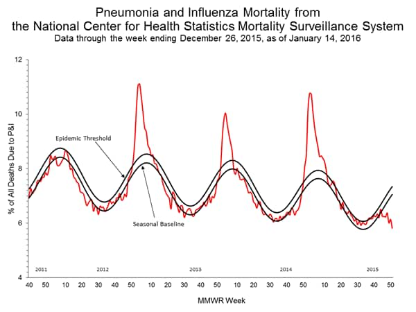
This chart is from the same page....http://www.cdc.gov/flu/weekly/. The periodicity of flu seasons and epidemics is still being studied. Peaks occur during the winter in northern latitudes at ~2–5 year intervals, usually during H3N2-dominant seasons, since the 1968 pandemic. Recent phylogenetic analysis of viruses from single populations has shown that the virus does not ‘over-summer’, but dies out at the end of each seasonal epidemic, and that subsequent seasonal viral re-emergence is ignited by imported genetic variation.

Or decreasing?

Weekly Map

http://www.cdc.gov/flu/weekly/usmap.htm

Monday, January 04, 2016

Wetland, Stream, and Species Mitigation Banks

With the November 3, 2015 Presidential Memorandum "Mitigating Impacts on Natural Resources from Development and Encouraging Related Private Investment," mitigation banking has been getting more press.

Back in 2008 the US Army Corps of Engineers (USACE) and the Environmental Protection Agency (EPA) issued the 2008 Compensatory Mitigation Rule governing compensatory mitigation for activities authorized by Corps permits.  Each division of USACE has published Regional Compensatory Mitigation and Monitoring Guidelines.

Mitigation banks are restoration and conservation sites that preserve, enhance, or create important ecological functions that may be impacted elsewhere.  For example, since 2008 wetland banks can invest in the for-profit creation of new wetlands; developers can purchase credits in the bank to mitigate any impacted wetlands in the same watershed as the proposed development.

There are now over 2000 mitigation banks in the U.S.

USACE  runs the RIBITS website, which is their Regulatory in-lieu fee and bank information tracking system.
This map from RIBITS shows the distribution of mitigation banks in the continental U.S.  Some USAE districts already have dozens to hundreds of banks in operation, whereas some, such as the Albuquerque USACE district, have none.


This figure, courtesy of Kevin Janni, shows the distribution of mitigation banks and HUC watersheds in Texas for the Fort Worth and Galveston USACE districts.  Each bank may only be used to offset development within the same watershed.  Due to differing application processes and timelines for different USACE district, some districts have many more banks than others.

Mitigation banks are evaluated based on the quality of the wetlands created, using rapid assessments such as NMRAM.

The 2016 Mitigation Banking Conference will be held in Texas, May 10-13.


Tuesday, October 13, 2015

Analysis of Soil and Vegetation Maps:  Accuracy and Utility for Describing Actual Habitats


There are four sources of landscape information from maps at the project level a few miles on a side.  Topogaphic maps, satellite maps, soil service maps, and vegetation maps.   
Comparing soil and vegetation maps at this scale is complicated by inaccuracies of both map sources and the strange ambiguity of aerial photography.  Soil was mapped by NRCS into 6 major soils.  However, two of the soils are described as compound soils, regions of undefined patches possibly intergrading continuously into one another.  For example, Pyote-Maljamar soils (PU on soil map) have a layer of fine sand everywhere, but there are unmapped bits and pieces of caliche at around 50 inches (Maljamar soils) in a matrix of deep sand (Pyote soils).

Soil map created using the NRCS Web Soil Survey showing major soil types.  PT and PU are deep sands, BH and KO are shallower silty soils, and TF is intermediate.  (PA and BA are extensions of PT and TF, respectively, in Eddy county.)


Soil Profiles:

PT
PU
TF
BH
KO
 Soil Name
Pyote
Pyote
Maljamar
Tunuco
Berino
Cacique
Kimbrough
0-10
A: Loamy fine sand
A: fine sand
A: fine sand
A: loamy fine sand
A: fine sand
A: fine sand
A: gravelly loam
10-20
AC: loamy fine sand
Btk: sandy clay loam
Bt: sandy clay loam
Bkm: cemented material
20-30
Bkm: cemented material

30-40
Bt: Fine sandy loam
Bt: fine sandy loam

Bt: sandy clay loam

Bkm: cemented material
40-50

50-60
Bkm: cemented material
Type 
Sandy eolian deposits
Sandy eolian deposits over sandy calcaereous alluvium
Calcaerous eolian deposits
Calcaerous alluvium and/or eolian deposits

Selected Soil Properties

PT
PU
TF
BH
KO
Depth to restrictive layer
>200cm
127cm
43cm
>200cm
15cm
Calcium Carbonate (CaCO3)%
2%
2%
0%
17%
15%
% sand
75.8%
81.9%
78.6%
62.6%
43.0%
Ksat (inches/hour)
7.8
8.5
12.6
1.7
0.5

In this part of NM, depth to a restrictive soil layer indicates the presence of caliche near the surface.  These petrocalcic horizons are denoted Bkm on the soil profile.  KO has the shallowest effective soil, followed by TF.  Some parts of BH appear quite shallow, but in the table the depth to a restrictive layer is listed as greater than 200cm, possibly because some of the soil (i.e. the Berino component) lacks a caliche layer. Caliche is composed of calcium carbonate, so BH and KO are listed with the most calcium, and the least sand in their profile. 

Saturated hydraulic conductivity (Ksat) refers to the ease with which pores in a saturated soil transmit water. The estimates are expressed in inches/hour for ease of comparison to possible rainfall rates. They are based on soil characteristics observed in the field, particularly structure, porosity, and texture.

Restrictive soil layers and overall soil texture contribute to the ability of a soil to drain water.  PT, PU, and TF are listed as very well drained soils because they can all drain more than 7 inches of rain an hour, whereas BH and KO are significantly less porous, draining only 1.7 and 0.5 inches of rain an hour, respectively.  Most of the water from heavy rains probably runs off of these soil types, limiting the amount available to grow plants. 

Saturated hydraulic conductivity is considered in the design of soil drainage systems and septic tank absorption fields. It probably has the greatest impact on plant production of any soil parameter in SE NM.

Hydraulic conductivity is the rate at which a soil can absorb water.  Red areas have the least ability to absorb rainfall, while blue areas have the greatest ability to absorb rainfall. Map created using NRCS Web Soil Survey.  

Vegetation Map
Vegetation map from USGS GAP Vegetation Mapper uses NatureServe Ecological System Classification.

Vegetation Map Key and Attributes

Table 3. Vegetation Map Key and Attributes
Color
ReGAP Community Name
Vegetation Type
Dominant Species
Accuracy

Great Plains Shortgrass Prairie
Grassland
Biennial wormwood, Russian thistle
Low – should be mapped as disturbed area

Mesquite Upland
Thornscrub
Mesquite, Catclaw Acacia, Mimosa, Yucca
High - mesquite dominant

Sandhill Shrubland
Shrub
Shinnery oak, Catclaw acacia, Giant dropseed
Medium – not all dune
N/A
Sandy Plains Semi-Desert Grassland
Grassland
Purple three-awn, Sand dropseed, Sand muhly
Low – not mapped

The GAP national land cover data, based on the NatureServe Ecological Systems Classification, are the foundation of the most detailed, consistent map of vegetative associations available for the United States.  The soil map is interpolated based on soil pits and vegetation patterns, so in a way it functions as a hand-drawn vegetation map.  Vegetation patterns have changed from the time the soil survey was completed (1960’s?) to now.  This GAP high-resolution vegetation map was produced via satellite mapping and computer algorithms. 

The prairies of the southern Great Plains are also called the Llano Estacado, a region where vast flat to rolling uplands are covered with blue grama grass.  However, this vegetation type is misclassified.  GAP maps roads and disturbed areas with low grass as shortgrass prairie (brown on image) because these areas look similar to prairie in multispectral satellite imagery.  It maps the rest of the project area as a fractal pattern of mesquite upland (mauve) patches and sandhill shrubland (green) patches. 

Mesquite has spread throughout areas with deep sandy soils and now forms the default vegetation community across much of the area. Mesquite can also invade sandhills and desert washes and other coarse-textured soil areas. It is especially invasive in grasslands such as Sandy Plains Semi-Desert Grasslands, Great Plains Shortgrass Prairie, and Chihuahan Semi-Desert Grasslands. 

Mesquite grows best when soils are deep, lacking the caliche or clay pan that would limit infiltration and storage of winter precipitation in deeper soils layers. Mesquite and other deep-rooted shrubs exploit the deep soil moisture that is unavailable to cacti or grasses. 

The effects of major soil boundaries are evident: deep sand (PT and PU) soils support more sandhill shrubland, whereas soils with shallow restrictive horizons (BH and KO) tend to have more mesquite upland patches.  The vegetation map fails to identify patches of Lehman lovegrass grasslands, or catclaw acacia shrublands, but it does correctly identify shinnery oak areas as sandhill shrubland. 

However, the map misses out on an important intermediate community, sandy plains semi-desert grassland.  Sandy plains grasslands are actually the dominant community throughout much of the project area.  It is distinguishable on the ground by the greater proportion of grass than shrubs on sandy soils, often with Aristida purpurea, Muhlenbergia arenicola, and especially Sporobolus flexuousus.  However, this community has been invaded by mesquite shrubs (some areas of which have been recently killed with herbicides) so these grassland patches can be difficult to distinguish from true shrublands.

Topo Map

A topo map shows that areas with accumulating sand are typically uplands, especially breaks in slope where winds drop eolian deposits.  Eroding, exposed slopes reveal deeper, more-developed paleosoils, possibly Pleistocene clays (Steve Hall, 2006 Geomorphology of Mescalero Sand Dunes).  

On top of soil and geomorphic landscape-determined vegetation patterns, local populations of invasive species have overlaid an unpredictable pattern of monocultures of Lehman Lovegrass, Artemisia biennis, and occasional plants of Salsola tragus around wellpads.  Note that none of these invasive species are NM state-listed noxious weeds.  There are also surprising areas of intact, diverse Chihuahuan grasslands with healthy stands of black grama , muhly arenicola, and sporobolus cryptandrus.  All of the sand dunes here, despite presence of shinnery oak, and even some Artemisia filifolia, are coppice or hummock dunes that formed around shrubs during historical time (Hall, 2006). 

 Conclusion

Unfortunately, there are no map sources of reliable data on habitats and vegetation communities at field- or project area-scale.  Each source provides valuable clues along with misleading simplifications, errors, and obfuscations of actual on-the-ground conditions. 

Appendix: Soil Properties Maps

Depth to a restrictive soil layer:

Percent sand:

Percent calcium carbonate: