Showing posts with label data. Show all posts

Thursday, May 21, 2026

Naturalist Participation Varies Between Arizona Counties

iNaturalist participation is unevenly distributed at the global, national, and local scale. I looked at county-level observations in Arizona to try to identify trends and potential causes of variability in total observations and percent of observations identified.

Introduction

Simple hypotheses for the total number of observations in each county could be that the iNaturalist observations vary proportionally to population (based on number of observers) or based on land area (based on availability of organisms to observe).  Alternately, a hypothesis could be that areas with more species, or areas with more parks and tourist attractions, might attract more attention from iNaturalist users. 

Simple hypotheses for the percent of observations identified could be that this varies with the population of a county, so that larger population counties would be more likely to have more experts able to identify local observations.  Although counties with more people might also have more total observations, so this hypothesis could suggest that the percent of observations identified is either consistent across counties or, if the identifier effect predominates, there could be a greater percent in counties with more people.  Conversely, rural counties with low populations that also have lots of observations from visitors (such as to national parks) might have a lower proportion of observations identified.

I queried the iNaturalist.org website in December, 2025 for total observations and Research Grade (RG) for each Arizona county.  Some taxa, like fish or reptiles, might me more abundant in one part of the state over another, so to ensure consistency, I chose a taxa of species that is relatively evenly distributed across Arizona:  flowering plants (angiosperms).  I also obtained county population and land area from publicly available information on the web.  I then calculated % observations ID’d to RG, total species observed, and total RG species confirmed for each county and averages across all counties.

Results

Arizona has 15 counties that vary by orders of magnitude in size, population, as well as other factors that contribute to iNaturalist participation such as number of national parks and tourists.  The largest county by population is Maricopa county, with more than 4.5 million people, whereas the smallest county has less than 10,000 people.  The largest county by land area is Coconino county, with more than 18,000 square miles, whereas Santa Cruz, the smallest county, only has a little more than 1,000 square miles. 

Figure 1 - Arizona Counties

iNaturalist observations of flowering plants vary from only about 3,000 in Greenlee county, to almost 300,000 in Pima county.  RG observations vary from less than 2,000 in Greenlee county, to more than 200,000 in Pima county, with corresponding proportions of observations identified ranging from a low of 46% in Navajo county to a high of 74% in La Paz county. 

Counties vary in documented biodiversity from a high of almost 1,900 species in Pima county, to a low of about 430 species in La Paz county. 

AZ Counties

angiosperm observations

RG angiosperm

% ID'd

species count

RG species

% RG species

Pima

298,000

211,000

71%

2,396

1,855

77%

Coconino

134,440

61,500

46%

2,197

1,489

68%

Cochise

122,500

79,550

65%

1,860

1,460

78%

Yavapai

87,000

48,620

56%

1,798

1,326

74%

Santa Cruz

47,000

28,000

60%

1,586

1,273

80%

Maricopa

217,000

156,000

72%

1,800

1,200

67%

Pinal

41,000

29,000

71%

1,288

976

76%

Gila

26,233

15,500

59%

1,240

938

76%

Mohave

36,000

26,000

72%

1,200

890

74%

Apache

20,468

9,575

47%

1,182

832

70%

Graham

12,700

7,780

61%

1,044

774

74%

Navajo

14,000

6,400

46%

1,000

714

71%

Yuma

18,800

13,800

73%

682

521

76%

Greenlee

3,300

1,895

57%

617

432

70%

La Paz

8,110

6,000

74%

517

429

83%

Average

72,437

46,708

62%

1,360

1,007

74%

Total

1,086,551

700,620


20,407

15,109


Table 1 Arizona Counties Angiosperm plant observations and % Identified

To investigate trends across counties I used Tableau Public to create graphs of total observations versus county land area and population.  Because Maricopa county has 3.5 million more people than the next largest county, I excluded it from the analysis as an outlier. 

While there is a trend toward more observations in larger geographic areas, it is not very strong; the county with the greatest number of observations is right in the middle of the distribution of sizes.  The trend toward more observations with more people is a bit better, but it is dominated by the 2nd most populated county in Arizona, Pima county.  Removing that county from the analysis essentially eliminates the trend, as the next largest county by population (Pinal) is below the average.


Figure 2 Observations by Land Area and Population, excluding Maricopa county.

I then looked at whether the activity of identifies varies with land area or population, and again I did not find simple trends that explain the variation.  It does appear that counties with smaller areas are more likely to have a greater proportion of reported species and observations identified.  This could be explained by the greater tractability of small areas, where large counties have more possible habitats, more potential species, and thus pose greater difficulty to botanists to identify plants across the whole county.  While the largest county, Coconino, does have the largest number of species reported, the smallest county (Santa Cruz) has more than the average number of species reported.  Also, two counties that are in the middle of the distribution (Yavapai and Cochise), have some of the highest number of reported species. 

Figure 3 RG Observations %R by Land Area and Population, excluding Maricopa county.

The trend between population and proportion of identified species is even weaker, with almost no trend apparent.  This leads me to reject the hypothesis that more people in an area necessarily lead to more identifications.

Instead, my current hypothesis, is that observation count is driven by other factors outside of total population or land area.  For example, I think that tourists who visit natural wonders such as the Grand Canyon disproportionately increase the number of observations and species in Coconino county, which results in a corresponding decrease in the proportion of observations and species identified.  In contrast, a county that has a strong resident population of people interested in nature, such as Pima county (Tucson), has a large  number of observations and species, but also has  a large proportion of those observations identified to species.


Saturday, January 31, 2026

DNA Barcodes, Klee Diagrams, and the Secrets of Speciation

Modern biodiversity detectives have found new ways to synthesize massive amounts of sequence data into clear information and insights. Two powerful tools to help visualize and understand the structure of life are DNA barcodes and Klee diagrams. Mark Stoeckle and David Thaler pioneered the use and explanation of these tools to offer insights into how species originated and evolved.

What is a DNA Barcode?

A DNA barcode is a short, standardized segment of the genome used for species identification. In the animal kingdom, the gold standard is a 648-base pair (bp) segment of the mitochondrial cytochrome c oxidase subunit I (COI) gene. While this segment represents less than one-millionth of an organism’s total genome, it has proven remarkably effective because mitochondrial DNA clusters largely overlap with species as defined by experts.

This tool is commonly used in eDNA samples to identify species from the environment. The BOLD (Barcode Of Life Database) now contains approximately five million of these barcodes, covering about 100,000 animal species. Interestingly, there is nothing inherently “special” about the COI gene biologically; it became the standard because reliable primers were adopted by a critical mass of the scientific community.

Visualizing Life: The Klee Diagram

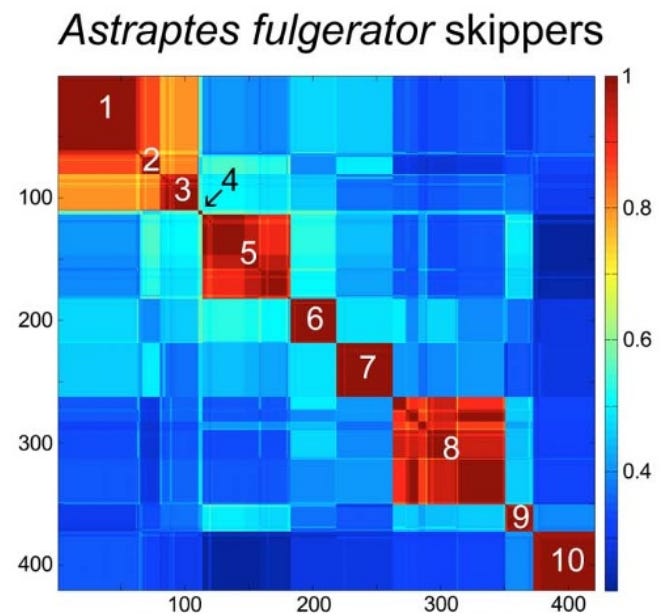
To make sense of these millions of sequences, scientists developed the Klee diagram, a heat map that displays correlations between DNA sequences. In these diagrams, every sequence is compared with every other sequence, and the intersections are color-coded to show similarity. (Sirovich, Lawrence, Mark Y. Stoeckle, and Yu Zhang. “Structural analysis of biodiversity.” PLoS One 5.2 (2010))

Species-level clusters in skipper butterfly Astraptes fulgerator COI barcode Klee diagram. Sequence clusters appear as blocks of high correlation along the diagonal and correspond to the 10 provisional species (1. INGCUP, 2. HIHAMP, 3. FABOV, 4. BYTTNER, 5. YESENN, 6. LONCHO, 7. LOHAMP, 8. SENNOV, 9. CELT, 10. TRIGO). Block sizes reflect number of sequences per species (n 3–88). Stoeckle and Coffran 2013.

Key features of Klee diagrams include:

• Indicator Vectors: Each DNA sample is listed on both the x and y axis and a heat map is generated comparing each species to itself (red=1, a perfect match) and all of the other samples in the database.

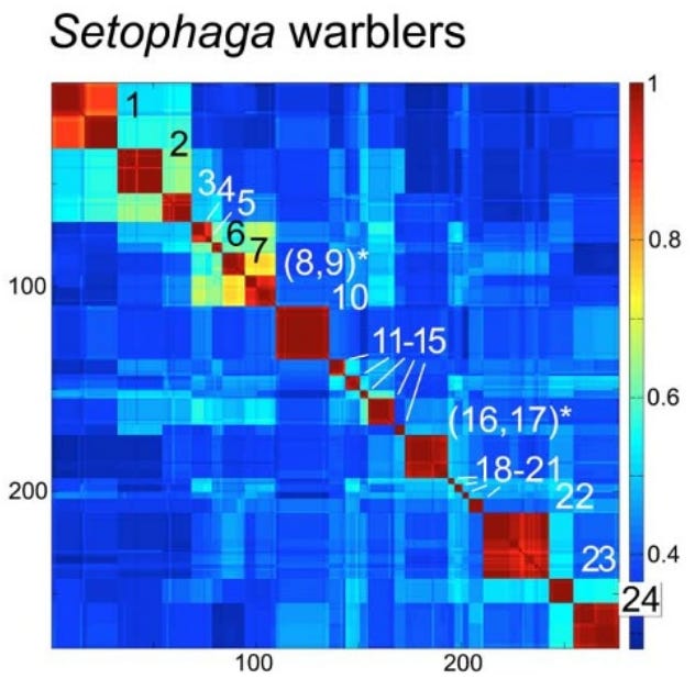
• Species Islands: When sequences are arrayed, species appear as sharp, non-overlapping squares. This visualization confirms that species are “islands in sequence space,” with distinct clusters and empty gaps between them.

• Scalability: Recent software developments like PyKleeBarcode allow these diagrams to be computed for very large datasets, potentially representing the whole animal kingdom in a single information space.

Species-level clusters in birds: Setophaga warblers COI barcode Klee. Blocks along the diagonal correspond to species; species with shared blocks are marked with an asterisk (1. petechiae, 2. striata, 3. pensylvanica, 4. nigrescens, 5. graciae, 6. discolor, 7. virens, 8. occidentalis,* 9. townsendi,* 10. magnolia, 11. tigrina, 12. castanea, 13. dominica, 14. palmarum, 15. citrina, 16. americana,* 17. pitiayumi,* 18. cerulea, 19. pinus, 20. kirtlandii, 21. fusca, 22. coronata, 23. caerulescens, 24. ruticilla). Stoeckle and Coffran 2013.

Evolutionary Implications: Why Mitochondria Define Species

A long controversy in biology concerns whether species are “real” or just human constructs. Dobzhansky, in his 1937 book Genetics and the Origin of Species, claimed that “Biological classification [of species] is simultaneously a man-made system of pigeonholes devised for the pragmatic purpose of recording observations… and an acknowledgement of the fact of organic discontinuity.”

Stoeckle and Thaler, in their 2018 paper “Why should mitochondria define species?”, expand on the evolutionary meaning behind these barcode clusters. They argue that the patterns seen in DNA barcodes are central facts of animal life that evolutionary theory must explain.

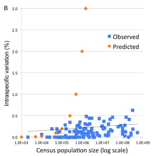
1. The “Barcode Gap” and Low Intraspecific Variation: Across the animal kingdom, the average pairwise difference (APD) within species is typically very low, between 0.0% and 0.5%. Meanwhile, the distance between even the most closely related species is usually 2% or more. This “gap” exists because intermediates between clusters are absent or rare.

2. The Neutrality of Synonymous Mutations: Most variation within and between these barcode clusters consists of synonymous substitutions; mutations that change the DNA sequence but not the resulting protein.

Stoeckle and Thaler argue that these changes are selectively neutral in mitochondria. This is because animal mitochondria are simpler than the nuclear genome; they lack introns (and thus splicing) and only have 22 different tRNA types. This lack of complexity means synonymous codons are less likely to affect the “fitness” of the organism, allowing them to accumulate as a “molecular clock”.

However, observed patterns of variation in DNA barcodes do not match the predictions of Kimura’s Neutral evolutionary theory of random accumulation of mutations.

Intraspecific variation and population size among 111 bird species with census estimates; species with geographic or hybrid clusters were excluded. Orange markers indicate predicted variation for a model species under neutral evolutionary drift. Stoeckle and Thaler 2014.

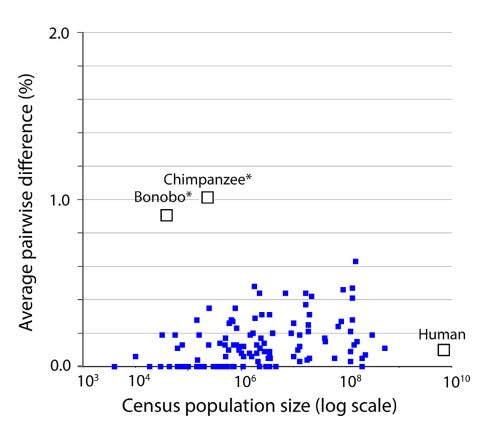
3. A Recent Universal Expansion? To reconcile these observations, Stoeckle and Thaler’s use humans as a case example. Modern humans have an APD of 0.1%, which is about average for the animal kingdom.

Several lines of evidence suggest that human mitochondria originated from a state of uniformity approximately 100,000 to 200,000 years ago before expanding. Stoeckle and Thaler propose that the extant populations of humans, and almost all other animal species, arrived at a similar result due to a similar process of expansion from mitochondrial uniformity within the same recent geological timeframe.

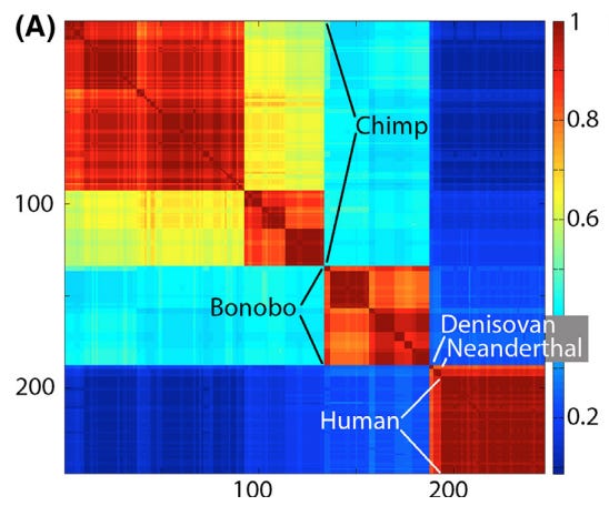
Klee diagram of mitochondrial genetic diversity of humans and our closest living and extinct relatives. The human sequences represent the span of known modern diversity. The Klee diagram heat map demonstrates greater mitochondrial diversity among chimpanzees and bonobos than among living humans. Thaler and Stoeckle 2016.

This coincides with Mayr’s 1942 idea that bottlenecks followed by expansion could explain speciation:

“The reduced variability of small populations is not always due to accidental gene loss, but sometimes to the fact that the entire population was started by a single pair or by a single fertilized female. These “founders” of the population carried with them only a very small proportion of the variability of the parent population. This “founder” principle sometimes explains even the uniformity of rather large populations…”

Mitochondrial genetic diversity, represented as average pairwise difference of COI barcodes, in relation to census population size in humans, chimpanzees, and bonobos compared to a well characterized set of birds (Stoeckle and Thaler 2014). Mitochondrial genetic diversity in humans is about 0.1%, less than that of many bird species, despite having more than 10-fold greater population than the most abundant bird in this dataset. Chimpanzees and bonobos have much smaller population sizes than humans, but conspicuously higher diversity, consistent with reproductively isolated subgroups. Thaler and Stoeckle 2016.

Conclusion

DNA barcodes and Klee diagrams do more than just identify species; they reveal a kingdom-wide pattern of organic discontinuity. Whether through population bottlenecks, lineage sorting, or gene sweeps, the uniform low variance across species suggests that the “islands” of biodiversity we see today are the result of deep evolutionary currents that affect all animals—from humans to birds to insects—in a surprisingly similar way.

Thaler and Stoeckler conclude their 2018 paper by noting that “there is irony but also grandeur in this view that, precisely because they have no phenotype, synonymous codon variations in mitochondria reveal the structure of species and the mechanism of speciation.”

Annotated Bibliography

Sirovich, Lawrence, Mark Y. Stoeckle, and Yu Zhang. “Structural analysis of biodiversity.” PLoS One 5.2 (2010): e9266.

- lays out math and originally defines “Klee diagrams”. Some examples.

Stoeckle, Mark Y., and Cameron Coffran. “TreeParser-aided Klee diagrams display taxonomic clusters in DNA barcode and nuclear gene datasets.” Scientific Reports 3.1 (2013): 2635.

- short and sweet version for Nature. Butterly and Warbler Klee examples.

Stoeckle, Mark Y., and David S. Thaler. “DNA barcoding works in practice but not in (neutral) theory.” PLoS one 9.7 (2014): e100755.

- first paper to note that the observed patterns in Klee diagrams, of homogenous species, doesn’t match neutral theory. OK.

Thaler, David S., and Mark Y. Stoeckle. “Bridging two scholarly islands enriches both: COI DNA barcodes for species identification versus human mitochondrial variation for the study of migrations and pathologies.” Ecology and Evolution 6.19 (2016): 6824-6835.

- short but good paper, cool data on humans, bonobos, and chimps, and comparison to results from their 2014 paper disproving neutral theory. Human/Chimp Klee example.

Stoeckle, Mark Y., and David S. Thaler. “Why should mitochondria define species?.” BioRxiv (2018): 276717.

- deep dive analysis that builds on 2014 observation that mitochondrial DNA barcodes don’t match expectations of neutral theory (”Species are islands in sequence space.”), while at the same time appearing to be created by neutral (synonymous) sequence changes. This is explained by evolutionary mechanisms of speciation, which has implications for how recent most species have become species. These results also help to resolve some of the disagreements about the definition of a species.

Duchemin W, Thaler DS (2023) PyKleeBarcode: Enabling representation of the whole animal kingdom in information space. PLOS ONE 18(6): e0286314.

- methods paper

Friday, January 16, 2026

A Decadal Porcupine Survey in Arizona

My last post was a summary of iNaturalist porcupine sightings in Arizona.  This post compares those results to previously published results.  Brown and Babb published the results of their 2000-2007 survey data in 2009 (Brown&Babb 2009) and McCarthy followed up with the results of his 2011-2015 survey in 2017 (McCarthy 2017).  

Since my results focus on porcupines observed since 2016, it is interesting to compare these three decades of porcupine surveys.

Also, Taylor published a comprehensive survey of Arizona porcupines in 1935 from work in the late 1920's and early 1930's.  


Porcupine Population

Porcupine populations can be estimated to some degree by the number of animals observed in a given time.  However, each of the studies used different methods to count porcupines, so the counts are not directly comparable.  

Brown and Babb and McCarthy asked land managers to report porcupines and they compiled the results.  The iNaturalist data I report was submitted by more than 100 iNaturalist observers who happened to encounter porcupines.  


Total Observations 


Porcupines 

Whether compiled from questionnaires sent to land managers or from interested naturalists, fewer than 20 verifiable porcupines are reported per year during this century.  Brown and Babb include data from one land manager from the North Kaibab / North Rim of the Grand Canyon who reported "hundreds" of porcupines, but this report is not an accurate or verifiable count and I excluded it from this analysis.

Taylor's report was motivated by "the porcupine problem" and noted several instances of hundreds of porcupines observed in a single day, more than any of the more recent studies observed in a single year.  The later studies all concluded that porcupines are rare but widely distributed across Arizona.   

Roadkill

The majority of the kills reported by McCarthy were between June and October (61%). They state that this correlates to the months when the porcupines are most active.

This is somewhat true of iNat data, where 50% were reported June to October, but there appears to be a spring peak as well that is not mentioned by McCarthy.  However note that 50% is only 6 animals out of the total 12 roadkill sightings in iNat data so there is not much statistical depth to this observation.  McCarthy's 61% figure is based on 14 animals out of the 23 total roadkill sightings, so their data is not much deeper.

There are many more total observations in iNat (183 versus McCarthy's 56 observations), however there are fewer roadkill sightings.  Therefore 41 % of McCarthy's observations were roadkill, whereas only 6% of the iNat observations are roadkill.  This may be due to citizen scientists bias against photographing dead animals, especially roadkill which are often gruesome to look at and unsafe to photograph.


Months when porcupines are most active

McCarthy states porcupines are most active June to October, however their data actually show broad seasonal activity from April to October.  Brown & Babb show higher sightings May to October.  In contrast, the iNat data show  activity throughout the year.  


Brown and Babb and McCarthy do not separately show seasonality of live porcupines.  In the iNat data, because of a spike in observations of dead porcupines in April, the phenology of live porcupines shows dips in both spring and fall and definitely does not support McCarthy's conclusion that porcupines are most active May-October.


Many of the iNat sightings are from deciduous trees (cottonwoods and willows) where porcupines are more visible during winter leaf-off. 

Previous research did not emphasize the importance of these deciduous species.  

Taylor commented that "Occurrences in junipers, willows. black walnuts, aspens, and cottonwoods are apparently limited to a very few records out of several hundred available. No evidence is at hand that the porcupine, in the Southwest proper, feeds to any extent on these last-named trees…"

Brown and Babb only reported 5 porcupines in riparian deciduous trees out of their total 214+ observations, and McCarthy only reported 4 in these trees out of his total 56 observations.

It is possible that the preponderance of iNat porcupines in these trees is due to observer bias, with the Willow lake and Petrified Forest hosting large numbers of hikers and nature enthusiasts. However, it should be noted that many other areas of the state (including the Grand Canyon and areas around Flagstaff) also host large numbers of recreationalists without reporting large numbers of porcupines.  However, as stated above, deciduous trees leaf-off state does make porcupines easier to spot.


Looking at iNat observations of live porcupines on the ground, it does look like they are most active in June, with elevated activity through October.


Porcupine Distribution

McCarthy reported a continuation of the observations by Brown and Babb, i.e. that porcupines are sparsely spread throughout the habitats where they have been reported.  While this is true as far as it goes, it does appear that there are certain areas of either greater porcupine population density or greater observer bias in photographing them.  About half of the iNat observations are from two discrete locations: Willow lake in Prescott, and Petrified Forest National Park near Holbrook.  

McCarthy noted that porcupines commonly occur in habitats that are not dominated by conifer trees.  That certainly continues to be the case in the iNat data.  Taylor's original paper noted that national forests were the preferred habitat of porcupines, but in more recent years they appear to be more common in deciduous forests, grasslands, and other non-conifer forest habitats.

There are areas of apparently good habitat that do not support porcupine populations.  The Prescott National Forest, despite extensive stands of ponderosa pine with mixed oak understory, has consistently been noted as not having many porcupines.  Brown and Babb reported 7, but interestingly these were all from grasslands, not the forests areas.  Based on personal communication with employees of the Forest, no porcupines have been observed recently on that forest.

Taylor noted: "The porcupine…appears to attain its greatest numbers in parts of the San Juan (Colorado), Carson and Cibola (New Mexico), Coconino and Tusayan (Arizona) national forests. On some forests where conditions seem as favorable as on those mentioned, as the Santa Fe, Manzano, Apache, Kaibab, and Sitgreaves, porcupines are for the most part scarce or of little economic importance. In general as one goes southward porcupines become less numerous. They are decidedly scarce on the Lincoln, Gila, Crook, Tonto, and Prescott forests."

Another area of apparently suitable habitat is the upper Verde river, which has an extensive stand of cottonwood and willow trees surrounded by wildlands.  Surveyors, who look for Yellow Billed Cuckoos throughout this area each month of the growing season, report that they have never seen a porcupine.  Yet porcupines are well known from the cottonwoods and willows around nearby Willow lake in Prescott.

Each of the previous authors have speculated that mountain lion predation may control porcupine abundance.  It may be that mountain lions are less present around Willow lake in Prescott and in Petrified Forest National Park, and more abundant along the upper verde and in the conifer forests of Prescott National Forest.  The present study cannot cast any light on that hypothesis.  

Another hypothesis for the patchy distribution of porcupines is habitat fragmentation by roads and other human development.  As discussed above, the present study did not find a high proportion of porcupine roadkill, but incidental observations and discussions suggests that porcupines are commonly killed on roads but those observations were not documented in iNaturalist.  

If porcupine populations are small and patchy in distribution, and if migrations between populations is difficult and uncertain, then porcupine populations may be reproductively isolated.  

Taylor:  "A noteworthy feature of porcupine distribution is its lack of uniformity. In some regions the animals will be fairly abundant, while in others, perhaps not far away, they will be scarce, although conditions appear to be equally favor-able."

Uldis Roze, in "The North American Porcupine," suggested that porcupines are dependent on a species-specific microbiome to digest their high cellulose diet of rough plant matter.  This is based on observations that when porcupines are introduced to a new area they consume the fecal pellets of resident porcupines in an apparent attempt to inoculate their microbiome.  Porcupines eat a wide variety of plant species, but individual porcupines are documented preferring certain plants, possibly based on their ability to digest them. 

If these ideas are correct, then porcupines may have difficulty colonizing areas that do not currently support porcupines.  It may take awhile to develop a "taste" for plants in different areas. If so, porcupine populations may be at risk of long term decline in Arizona.  Small and isolated populations may die out, and if nearby porcupines cannot safely travel and cannot easily digest the different plants in those areas, it may be difficult or impossible to replace extirpated populations.  

Taylor: "The porcupine must occasionally, if not regularly, make long trips across country. It must possess considerable capacity to adapt itself to whatever dens, natural burrows, rocky shelters, or vegetative cover it can find in the non-timbered areas into which it roams. The obvious wanderlust of the animal must tend to insure the species the widest possible geographic and ecologic range. Foster reports occasional porcupines found in badger holes in the treeless Williamson valley, Yavapai county, Arizona."

The large continuous band of conifers across the national forests of Arizona should continue to provide habitat for sustainable porcupine populations.  Hopefully the few scattered iNat observations across this area are few and scattered due to lack of observers and not lack of porcupines.  If porcupines are  not doing well in this bastion of habitat they indeed face an uncertain future in Arizona.

The American Southwest, including parts of Texas, NM, and Arizona marks the southern extent of porcupines except for a few endangered populations in the mountains of Mexico.  As the climate warms, it is possible that porcupines find Arizona's environment increasingly challenging.  However, Taylor states that porcupines are limited by food availability, not climatic extremes.

Citations
Brown, David E., and Randall D. Babb. "Status of the Porcupine (Erithizon dorsatuh) in Arizona, 2000–2007." Journal of the Arizona-Nevada Academy of Science 41.2 (2009): 36-41.

McCarthy, Michael. "Porcupines (Erethizon dorsatum) in Arizona, 2011–2015." Journal of the Arizona-Nevada Academy of Science 47.1 (2017): 19-22.

Roze, Uldis. The North American porcupine. Cornell University Press, 2009.

Taylor, Walter Penn. Ecology and life history of the porcupine (Erethizon epixanthum) as related to the forests of Arizona and the southwestern United States. No. 3. University of Arizona, 1935.