Saturday, January 31, 2026

DNA Barcodes, Klee Diagrams, and the Secrets of Speciation

Modern biodiversity detectives have found new ways to synthesize massive amounts of sequence data into clear information and insights. Two powerful tools to help visualize and understand the structure of life are DNA barcodes and Klee diagrams. Mark Stoeckle and David Thaler pioneered the use and explanation of these tools to offer insights into how species originated and evolved.

What is a DNA Barcode?

A DNA barcode is a short, standardized segment of the genome used for species identification. In the animal kingdom, the gold standard is a 648-base pair (bp) segment of the mitochondrial cytochrome c oxidase subunit I (COI) gene. While this segment represents less than one-millionth of an organism’s total genome, it has proven remarkably effective because mitochondrial DNA clusters largely overlap with species as defined by experts.

This tool is commonly used in eDNA samples to identify species from the environment. The BOLD (Barcode Of Life Database) now contains approximately five million of these barcodes, covering about 100,000 animal species. Interestingly, there is nothing inherently “special” about the COI gene biologically; it became the standard because reliable primers were adopted by a critical mass of the scientific community.

Visualizing Life: The Klee Diagram

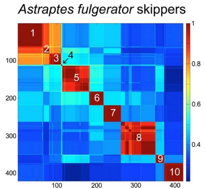
To make sense of these millions of sequences, scientists developed the Klee diagram, a heat map that displays correlations between DNA sequences. In these diagrams, every sequence is compared with every other sequence, and the intersections are color-coded to show similarity. (Sirovich, Lawrence, Mark Y. Stoeckle, and Yu Zhang. “Structural analysis of biodiversity.” PLoS One 5.2 (2010))

Species-level clusters in skipper butterfly Astraptes fulgerator COI barcode Klee diagram. Sequence clusters appear as blocks of high correlation along the diagonal and correspond to the 10 provisional species (1. INGCUP, 2. HIHAMP, 3. FABOV, 4. BYTTNER, 5. YESENN, 6. LONCHO, 7. LOHAMP, 8. SENNOV, 9. CELT, 10. TRIGO). Block sizes reflect number of sequences per species (n 3–88). Stoeckle and Coffran 2013.

Key features of Klee diagrams include:

• Indicator Vectors: Each DNA sample is listed on both the x and y axis and a heat map is generated comparing each species to itself (red=1, a perfect match) and all of the other samples in the database.

• Species Islands: When sequences are arrayed, species appear as sharp, non-overlapping squares. This visualization confirms that species are “islands in sequence space,” with distinct clusters and empty gaps between them.

• Scalability: Recent software developments like PyKleeBarcode allow these diagrams to be computed for very large datasets, potentially representing the whole animal kingdom in a single information space.

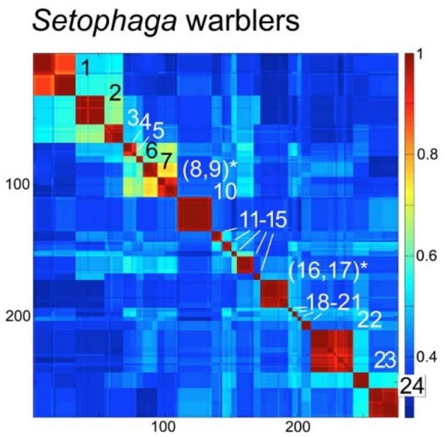
Species-level clusters in birds: Setophaga warblers COI barcode Klee. Blocks along the diagonal correspond to species; species with shared blocks are marked with an asterisk (1. petechiae, 2. striata, 3. pensylvanica, 4. nigrescens, 5. graciae, 6. discolor, 7. virens, 8. occidentalis,* 9. townsendi,* 10. magnolia, 11. tigrina, 12. castanea, 13. dominica, 14. palmarum, 15. citrina, 16. americana,* 17. pitiayumi,* 18. cerulea, 19. pinus, 20. kirtlandii, 21. fusca, 22. coronata, 23. caerulescens, 24. ruticilla). Stoeckle and Coffran 2013.

Evolutionary Implications: Why Mitochondria Define Species

A long controversy in biology concerns whether species are “real” or just human constructs. Dobzhansky, in his 1937 book Genetics and the Origin of Species, claimed that “Biological classification [of species] is simultaneously a man-made system of pigeonholes devised for the pragmatic purpose of recording observations… and an acknowledgement of the fact of organic discontinuity.”

Stoeckle and Thaler, in their 2018 paper “Why should mitochondria define species?”, expand on the evolutionary meaning behind these barcode clusters. They argue that the patterns seen in DNA barcodes are central facts of animal life that evolutionary theory must explain.

1. The “Barcode Gap” and Low Intraspecific Variation: Across the animal kingdom, the average pairwise difference (APD) within species is typically very low, between 0.0% and 0.5%. Meanwhile, the distance between even the most closely related species is usually 2% or more. This “gap” exists because intermediates between clusters are absent or rare.

2. The Neutrality of Synonymous Mutations: Most variation within and between these barcode clusters consists of synonymous substitutions; mutations that change the DNA sequence but not the resulting protein.

Stoeckle and Thaler argue that these changes are selectively neutral in mitochondria. This is because animal mitochondria are simpler than the nuclear genome; they lack introns (and thus splicing) and only have 22 different tRNA types. This lack of complexity means synonymous codons are less likely to affect the “fitness” of the organism, allowing them to accumulate as a “molecular clock”.

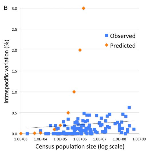
However, observed patterns of variation in DNA barcodes do not match the predictions of Kimura’s Neutral evolutionary theory of random accumulation of mutations.

Intraspecific variation and population size among 111 bird species with census estimates; species with geographic or hybrid clusters were excluded. Orange markers indicate predicted variation for a model species under neutral evolutionary drift. Stoeckle and Thaler 2014.

3. A Recent Universal Expansion? To reconcile these observations, Stoeckle and Thaler’s use humans as a case example. Modern humans have an APD of 0.1%, which is about average for the animal kingdom.

Several lines of evidence suggest that human mitochondria originated from a state of uniformity approximately 100,000 to 200,000 years ago before expanding. Stoeckle and Thaler propose that the extant populations of humans, and almost all other animal species, arrived at a similar result due to a similar process of expansion from mitochondrial uniformity within the same recent geological timeframe.

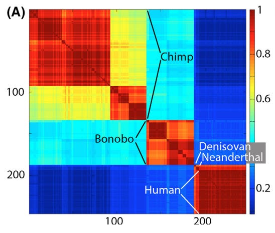
Klee diagram of mitochondrial genetic diversity of humans and our closest living and extinct relatives. The human sequences represent the span of known modern diversity. The Klee diagram heat map demonstrates greater mitochondrial diversity among chimpanzees and bonobos than among living humans. Thaler and Stoeckle 2016.

This coincides with Mayr’s 1942 idea that bottlenecks followed by expansion could explain speciation:

“The reduced variability of small populations is not always due to accidental gene loss, but sometimes to the fact that the entire population was started by a single pair or by a single fertilized female. These “founders” of the population carried with them only a very small proportion of the variability of the parent population. This “founder” principle sometimes explains even the uniformity of rather large populations…”

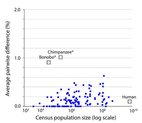
Mitochondrial genetic diversity, represented as average pairwise difference of COI barcodes, in relation to census population size in humans, chimpanzees, and bonobos compared to a well characterized set of birds (Stoeckle and Thaler 2014). Mitochondrial genetic diversity in humans is about 0.1%, less than that of many bird species, despite having more than 10-fold greater population than the most abundant bird in this dataset. Chimpanzees and bonobos have much smaller population sizes than humans, but conspicuously higher diversity, consistent with reproductively isolated subgroups. Thaler and Stoeckle 2016.

Conclusion

DNA barcodes and Klee diagrams do more than just identify species; they reveal a kingdom-wide pattern of organic discontinuity. Whether through population bottlenecks, lineage sorting, or gene sweeps, the uniform low variance across species suggests that the “islands” of biodiversity we see today are the result of deep evolutionary currents that affect all animals—from humans to birds to insects—in a surprisingly similar way.

Thaler and Stoeckler conclude their 2018 paper by noting that “there is irony but also grandeur in this view that, precisely because they have no phenotype, synonymous codon variations in mitochondria reveal the structure of species and the mechanism of speciation.”

Annotated Bibliography

Sirovich, Lawrence, Mark Y. Stoeckle, and Yu Zhang. “Structural analysis of biodiversity.” PLoS One 5.2 (2010): e9266.

- lays out math and originally defines “Klee diagrams”. Some examples.

Stoeckle, Mark Y., and Cameron Coffran. “TreeParser-aided Klee diagrams display taxonomic clusters in DNA barcode and nuclear gene datasets.” Scientific Reports 3.1 (2013): 2635.

- short and sweet version for Nature. Butterly and Warbler Klee examples.

Stoeckle, Mark Y., and David S. Thaler. “DNA barcoding works in practice but not in (neutral) theory.” PLoS one 9.7 (2014): e100755.

- first paper to note that the observed patterns in Klee diagrams, of homogenous species, doesn’t match neutral theory. OK.

Thaler, David S., and Mark Y. Stoeckle. “Bridging two scholarly islands enriches both: COI DNA barcodes for species identification versus human mitochondrial variation for the study of migrations and pathologies.” Ecology and Evolution 6.19 (2016): 6824-6835.

- short but good paper, cool data on humans, bonobos, and chimps, and comparison to results from their 2014 paper disproving neutral theory. Human/Chimp Klee example.

Stoeckle, Mark Y., and David S. Thaler. “Why should mitochondria define species?.” BioRxiv (2018): 276717.

- deep dive analysis that builds on 2014 observation that mitochondrial DNA barcodes don’t match expectations of neutral theory (”Species are islands in sequence space.”), while at the same time appearing to be created by neutral (synonymous) sequence changes. This is explained by evolutionary mechanisms of speciation, which has implications for how recent most species have become species. These results also help to resolve some of the disagreements about the definition of a species.

Duchemin W, Thaler DS (2023) PyKleeBarcode: Enabling representation of the whole animal kingdom in information space. PLOS ONE 18(6): e0286314.

- methods paper

Friday, January 16, 2026

A Decadal Porcupine Survey in Arizona

My last post was a summary of iNaturalist porcupine sightings in Arizona.  This post compares those results to previously published results.  Brown and Babb published the results of their 2000-2007 survey data in 2009 (Brown&Babb 2009) and McCarthy followed up with the results of his 2011-2015 survey in 2017 (McCarthy 2017).  

Since my results focus on porcupines observed since 2016, it is interesting to compare these three decades of porcupine surveys.

Also, Taylor published a comprehensive survey of Arizona porcupines in 1935 from work in the late 1920's and early 1930's.  


Porcupine Population

Porcupine populations can be estimated to some degree by the number of animals observed in a given time.  However, each of the studies used different methods to count porcupines, so the counts are not directly comparable.  

Brown and Babb and McCarthy asked land managers to report porcupines and they compiled the results.  The iNaturalist data I report was submitted by more than 100 iNaturalist observers who happened to encounter porcupines.  


Total Observations 


Porcupines 

Whether compiled from questionnaires sent to land managers or from interested naturalists, fewer than 20 verifiable porcupines are reported per year during this century.  Brown and Babb include data from one land manager from the North Kaibab / North Rim of the Grand Canyon who reported "hundreds" of porcupines, but this report is not an accurate or verifiable count and I excluded it from this analysis.

Taylor's report was motivated by "the porcupine problem" and noted several instances of hundreds of porcupines observed in a single day, more than any of the more recent studies observed in a single year.  The later studies all concluded that porcupines are rare but widely distributed across Arizona.   

Roadkill

The majority of the kills reported by McCarthy were between June and October (61%). They state that this correlates to the months when the porcupines are most active.

This is somewhat true of iNat data, where 50% were reported June to October, but there appears to be a spring peak as well that is not mentioned by McCarthy.  However note that 50% is only 6 animals out of the total 12 roadkill sightings in iNat data so there is not much statistical depth to this observation.  McCarthy's 61% figure is based on 14 animals out of the 23 total roadkill sightings, so their data is not much deeper.

There are many more total observations in iNat (183 versus McCarthy's 56 observations), however there are fewer roadkill sightings.  Therefore 41 % of McCarthy's observations were roadkill, whereas only 6% of the iNat observations are roadkill.  This may be due to citizen scientists bias against photographing dead animals, especially roadkill which are often gruesome to look at and unsafe to photograph.


Months when porcupines are most active

McCarthy states porcupines are most active June to October, however their data actually show broad seasonal activity from April to October.  Brown & Babb show higher sightings May to October.  In contrast, the iNat data show  activity throughout the year.  


Brown and Babb and McCarthy do not separately show seasonality of live porcupines.  In the iNat data, because of a spike in observations of dead porcupines in April, the phenology of live porcupines shows dips in both spring and fall and definitely does not support McCarthy's conclusion that porcupines are most active May-October.


Many of the iNat sightings are from deciduous trees (cottonwoods and willows) where porcupines are more visible during winter leaf-off. 

Previous research did not emphasize the importance of these deciduous species.  

Taylor commented that "Occurrences in junipers, willows. black walnuts, aspens, and cottonwoods are apparently limited to a very few records out of several hundred available. No evidence is at hand that the porcupine, in the Southwest proper, feeds to any extent on these last-named trees…"

Brown and Babb only reported 5 porcupines in riparian deciduous trees out of their total 214+ observations, and McCarthy only reported 4 in these trees out of his total 56 observations.

It is possible that the preponderance of iNat porcupines in these trees is due to observer bias, with the Willow lake and Petrified Forest hosting large numbers of hikers and nature enthusiasts. However, it should be noted that many other areas of the state (including the Grand Canyon and areas around Flagstaff) also host large numbers of recreationalists without reporting large numbers of porcupines.  However, as stated above, deciduous trees leaf-off state does make porcupines easier to spot.


Looking at iNat observations of live porcupines on the ground, it does look like they are most active in June, with elevated activity through October.


Porcupine Distribution

McCarthy reported a continuation of the observations by Brown and Babb, i.e. that porcupines are sparsely spread throughout the habitats where they have been reported.  While this is true as far as it goes, it does appear that there are certain areas of either greater porcupine population density or greater observer bias in photographing them.  About half of the iNat observations are from two discrete locations: Willow lake in Prescott, and Petrified Forest National Park near Holbrook.  

McCarthy noted that porcupines commonly occur in habitats that are not dominated by conifer trees.  That certainly continues to be the case in the iNat data.  Taylor's original paper noted that national forests were the preferred habitat of porcupines, but in more recent years they appear to be more common in deciduous forests, grasslands, and other non-conifer forest habitats.

There are areas of apparently good habitat that do not support porcupine populations.  The Prescott National Forest, despite extensive stands of ponderosa pine with mixed oak understory, has consistently been noted as not having many porcupines.  Brown and Babb reported 7, but interestingly these were all from grasslands, not the forests areas.  Based on personal communication with employees of the Forest, no porcupines have been observed recently on that forest.

Taylor noted: "The porcupine…appears to attain its greatest numbers in parts of the San Juan (Colorado), Carson and Cibola (New Mexico), Coconino and Tusayan (Arizona) national forests. On some forests where conditions seem as favorable as on those mentioned, as the Santa Fe, Manzano, Apache, Kaibab, and Sitgreaves, porcupines are for the most part scarce or of little economic importance. In general as one goes southward porcupines become less numerous. They are decidedly scarce on the Lincoln, Gila, Crook, Tonto, and Prescott forests."

Another area of apparently suitable habitat is the upper Verde river, which has an extensive stand of cottonwood and willow trees surrounded by wildlands.  Surveyors, who look for Yellow Billed Cuckoos throughout this area each month of the growing season, report that they have never seen a porcupine.  Yet porcupines are well known from the cottonwoods and willows around nearby Willow lake in Prescott.

Each of the previous authors have speculated that mountain lion predation may control porcupine abundance.  It may be that mountain lions are less present around Willow lake in Prescott and in Petrified Forest National Park, and more abundant along the upper verde and in the conifer forests of Prescott National Forest.  The present study cannot cast any light on that hypothesis.  

Another hypothesis for the patchy distribution of porcupines is habitat fragmentation by roads and other human development.  As discussed above, the present study did not find a high proportion of porcupine roadkill, but incidental observations and discussions suggests that porcupines are commonly killed on roads but those observations were not documented in iNaturalist.  

If porcupine populations are small and patchy in distribution, and if migrations between populations is difficult and uncertain, then porcupine populations may be reproductively isolated.  

Taylor:  "A noteworthy feature of porcupine distribution is its lack of uniformity. In some regions the animals will be fairly abundant, while in others, perhaps not far away, they will be scarce, although conditions appear to be equally favor-able."

Uldis Roze, in "The North American Porcupine," suggested that porcupines are dependent on a species-specific microbiome to digest their high cellulose diet of rough plant matter.  This is based on observations that when porcupines are introduced to a new area they consume the fecal pellets of resident porcupines in an apparent attempt to inoculate their microbiome.  Porcupines eat a wide variety of plant species, but individual porcupines are documented preferring certain plants, possibly based on their ability to digest them. 

If these ideas are correct, then porcupines may have difficulty colonizing areas that do not currently support porcupines.  It may take awhile to develop a "taste" for plants in different areas. If so, porcupine populations may be at risk of long term decline in Arizona.  Small and isolated populations may die out, and if nearby porcupines cannot safely travel and cannot easily digest the different plants in those areas, it may be difficult or impossible to replace extirpated populations.  

Taylor: "The porcupine must occasionally, if not regularly, make long trips across country. It must possess considerable capacity to adapt itself to whatever dens, natural burrows, rocky shelters, or vegetative cover it can find in the non-timbered areas into which it roams. The obvious wanderlust of the animal must tend to insure the species the widest possible geographic and ecologic range. Foster reports occasional porcupines found in badger holes in the treeless Williamson valley, Yavapai county, Arizona."

The large continuous band of conifers across the national forests of Arizona should continue to provide habitat for sustainable porcupine populations.  Hopefully the few scattered iNat observations across this area are few and scattered due to lack of observers and not lack of porcupines.  If porcupines are  not doing well in this bastion of habitat they indeed face an uncertain future in Arizona.

The American Southwest, including parts of Texas, NM, and Arizona marks the southern extent of porcupines except for a few endangered populations in the mountains of Mexico.  As the climate warms, it is possible that porcupines find Arizona's environment increasingly challenging.  However, Taylor states that porcupines are limited by food availability, not climatic extremes.

Citations
Brown, David E., and Randall D. Babb. "Status of the Porcupine (Erithizon dorsatuh) in Arizona, 2000–2007." Journal of the Arizona-Nevada Academy of Science 41.2 (2009): 36-41.

McCarthy, Michael. "Porcupines (Erethizon dorsatum) in Arizona, 2011–2015." Journal of the Arizona-Nevada Academy of Science 47.1 (2017): 19-22.

Roze, Uldis. The North American porcupine. Cornell University Press, 2009.

Taylor, Walter Penn. Ecology and life history of the porcupine (Erethizon epixanthum) as related to the forests of Arizona and the southwestern United States. No. 3. University of Arizona, 1935.

Saturday, December 27, 2025

Porcupines in Arizona


An Arizona Porcupine observed at Willow Lake in Prescott.  Link to iNat observation.  


Porcupines are infrequently observed in Arizona, with only 206 total observations on iNaturalist since 2009, of which 198 are positively identifiable.  (Compared to about 900 observations in New Mexico.)  

Of the 198 in Arizona, 35 were at Willow Lake in Prescott, 55 at Petrified Forest National Park in NE Arizona, and about 30 between Williams and Flagstaff.  The remaining 78 were observed in ecosystems across the state, except for the Sonoran desert.

102 were observed on the ground, but 24 were dead, and half of those (6% of the total) were roadkill (viewer discretion advised).

Porcupine dead on road in Prescott.  Link to iNat observation.

96 porcupines were observed using different tree species as habitat.  The most common tree was cottonwood (Populus fremontii), followed by Ponderosa Pine (Pinus brachyptera).  Willows (Salix goodinggii) were also frequent.  Porcupines were observed in all common tree species, including oaks (Quercus), Junipers (Juniperus), Pinyon pines, Elms, and Douglas Fir (Pseudotsuga menziesii).  

Porcupine in cottonwood tree, Willow lake. Link to iNat observation. 


Friday, December 19, 2025

What's up with iNat in Japan?

 I recently listened to a fascinating podcast about the naturalist community in Japan, specifically the entomology fanatics. However, when I look at iNaturalist statistics for Japan, there appear to be very few observations/observers/identifiers given the population and level of development.

image

This figure shows the number of Observations, Observers, and Identifiers for select countries that have similar populations. Japan (red X) is way below the trend lines for all 3 metrics. The full dataset can be explored interactively on Tableau.

Interestingly, South Korea (blue triangle) clusters with Japan, although South Korea has a population that is less than 1/2 that of Japan.

Based on feedback from the iNat forum, it seems likely that nature-nerds in some of these countries are using other platforms to record their observations.

However, if they are using other platforms, they do not record data in a universal format that is indexed in the Global Biodiversity Information Facility (GBIF):

image

This chart shows GBIF records from Japan.

Hopefully over time more people will discover iNaturalist to record their natural history observations!

Friday, October 17, 2025

Desert People Without Water

I recently visited the ruins at Honanki and Palatki.  These are prehistoric settlements built into the red rock cliffs near Sedona, AZ.  Today, the people who built these dwellings are called "Sinagua", which comes from Spanish for "without water".  But everyone needs water, right?  I wondered where these people got drinking water.

I looked for springs around Honanki and Palatki and didn't find any.  That's weird!

Zoom in to see locations of Honanki (H) and Palatki (P) in relation to USGS-mapped springs (blue) and NAU-mapped springs (green).

Although springs have dried up in recent times, the USGS spring data was mapped in the late 1800s / early 1900s when many more springs were flowing.  It looks like the geology of the Sedona Red Rock cliffs just don't produce springs.  So even if the location of springs was different 800 years ago, it would be surprising if there were springs in the cliffs where these people lived.

The closest mapped spring (blue dot = unconfirmed water source) is 1.5 and 2.7 miles away, respectively, but there is no evidence of water in the aerial imagery.  The next closest (green dot = confirmed water source) is 4.7 and 3 miles away, respectively.   Neither Palatki nor Honanki is even built in one of the larger drainages that might flow more often/longer; the drainages that feed their valleys are quite short.  

I don't think these settlements had access to aboveground water throughout the year unless they dug wells or used cisterns to store water.

These and other prehistoric communities in the desert Southwest often built cliff dwellings high above canyon floors, far from surface water sources.  Archaeologists believe these people collected runoff during rainstorms using check dams and seeps, and stored water in cisterns or ceramic containers for later use.

Across the prehistoric Southwest, populations used ingenious methods to exploit scarce water:

  • Rock overhangs and cisterns captured and stored rainwater.
  • Seasonal mobility allowed families to occupy dry sites part of the year.
  • Terraced fields, check dams, and soil-retention walls conserved moisture for crops.
  • Small permanent settlements clustered near ephemeral water sources, such as seeps and seasonal pools.

In conclusion, while many large settlements in the prehistoric Southwest were built near springs or rivers, groups like the Anasazi, Sinagua, and others developed highly effective ways to survive in water-scarce environments through dry-land agriculture, runoff collection, and strategic mobility.

Tuesday, October 14, 2025

Atmospheric Streams Subsidize Valley Forests

I invented a new term to describe small-scale flows of water in the atmosphere.  Just as atmospheric rivers are large flows that transport tropical moisture thousands of miles to the mid-Latitudes, atmospheric streams share the moisture of the mountains with the valleys.

Example of an atmospheric river: Hurricane Priscilla projected track from October 7, 2025.  The remains of this storm brought copious moisture to the desert Southwest.


I first starting thinking about this when I noticed that the new weather station in the Watson Woods Riparian Preserve was often colder in the mornings than weather stations on the surrounding hills.  

Note the 40 degree temperature swing from cool (30's!) temperatures at night, to warm (80's) temperature during the day.

This is caused by katabatic winds from the mountains:

"On clear nights with calm winds, the ground cools rapidly. Air in contact with the colder ground cools by conducting heat to the ground. When this cooling process occurs along mountain slopes, the cooling air becomes colder and denser than the air away from the slopes, which causes the cold air to sink downslope. The dense cold air flows downslope in streams (called katabatic winds) following the steepest slopes. When the cold air flows into a relatively flat area (a mountain or river valley, for example), the streams of cold air slow down. This causes the valley to fill with cold air, much like streams filling a lake. "(MountWashington.org)

Hubbard Brook Experimental Forest, a good example of cold air drainage.

Atmospheric streams are distinct from the riparian drainages they follow, because air flows differently than water:

"Air flows in much larger volumes relative to the topographic surface. Water, even in hillside gullies, flows in volumes that are small relative to the scale of the landscape, and hence topography is the major control on the flow. Air masses are generally much larger relative to the landscape. This can lead to rather different effects. When a shallow cold air flow is moving slowly or is strongly stratified, it can become trapped by topographic barriers that would not trap water. Conversely, when the cold air flow is rapid or has lower stratification, it can flow over barriers, rather than go around them and so minimize friction.” (Research Meteorology)

Cold air flows are an important part of riparian ecology.  A study at the Coweeta Long Term Ecological Research (LTER) site found that cold air drainage subsidizes valley ecosystem productivity.  The study observed lower temperature air from the mountains cooling riparian forests, which lowered their carbon loss due to plant respiration.  The cool air must be a welcome respite for plants during the heat of summer.

Image from Coweeta LTER site in the South Carolina Appalachian mountains.

Cool mountain air can also be moister than valley air, especially in arid regions like Arizona.  Riparian streams carry water from mountains to valleys, while invisible atmospheric streams carry water in the form of humidity.  The extra boost in humidity only becomes visible (as fog) when the temperature drops below the dew point. The studies I looked at did not measure humidity, but it makes sense that higher elevation forests would have moister air than the hotter valleys.  When they share their air, they share their water.

Atmospheric streams are an important, but often overlooked, part of the global water cycle that carries moisture from the land to the ocean.  The recycling and transport of water from one part of the land to another part is sometimes called the "small water cycle".  We still have much to learn about the way our planet works!

El autobus magico: viaja por el agua

Tuesday, September 30, 2025

Tortoise Population Zone Trends

Continuing my analysis of iNat tortoise and reptile data, I looked at whether the observed changes in proportion of reptile species encountered was different in urban and urbanizing zones.  I hypothesized that the continuing expansion of large cities in tortoise habitat could be contributing to their decline.

Methods

I downloaded iNat data for AZ reptile species and mapped the points in GIS. I only looked at full species instead of including named subspecies as I had in my previous analysis. Based on that previous analysis, it seemed possible that changes in subspecies identification could be accounting for some of the observed changes and I wanted to remove that potential source of bias.

I then subjectively defined polygons around the large urban zones of Phoenix and Tucson and used the Identify tool to add Phoenix and Tucson labels to all points within those areas.  Note that although the study area includes other towns in Arizona (such as Prescott and Flagstaff) I did not choose to define those areas as "urban". 

Phoenix urban zone.  220 total tortoise observations.
Tucson urban zone:  795 observations.

I also considered whether geopoint accuracy would impact the results, so I conducted the following analysis including and excluding points with no or low (greater than 1000m) accuracy.  However, because I did not see a difference I will simply present results for all data points (i.e. no geopoint accuracy exclusion).

Results: Urban Zones

The majority of tortoise observations are from urban zones, especially Tucson.


It is not possible to determine if more tortoises live around Phoenix and Tucson compared to remote areas; iNat data collection is opportunistic, so places where people live are more heavily sampled than remote areas.  This result is an important caveat to my previous results: iNat observation trends are most representative of urban zones and any observed changes do not necessarily represent changes in all areas of Arizona.


The proportion of tortoise observations has been increasing in urban zones, especially Tucson. From 2013-2025, although there is some noise early on (e.g. 2014) due to low observation counts, the general trend is apparent that Tucson increased from ~45% to ~55% of total observations, while areas outside metro zones decreased from ~40% to ~20%.

This could contradict my hypothesis (that tortoises are declining in areas of urban development), or it could be due to increased observers in urban zones.   


Reptile observations show the same overall trend of increasing observations in urban zones. The proportion of iNat reptile observations for Phoenix increased from 10% to 20%, Tucson increased from 30% to 40%, and non-urban areas decreased from 60% to 45%.

Reptile Observation Trends

I wondered whether the amount of urban versus non-urban observations could explain the changes I observed in reptile species observations.

Updated Reptile Observation Trends

The 26 species of reptiles with more than 1000 observations

There were 26 species of reptiles with more than 1000 observations in the study area.  They ranged from species with 100% urban observations (San Esteban Island Iguana, introduced) to species with 0% urban observations (Plateau Fence lizard).  The colored cells show population change from a 2018 baseline.  Look for areas of red-green or green-red, because those indicate consistent trends from 2013-2025.  Red for both indicate 2018 was a high point.  Green for both indicate 2018 was a low point.  

I then plotted % change against proportion of non-urban observations to look for trends and outliers.


First graph: The point at 100% non-urban and 50% change is Plateau Fence lizard, which is very common in Prescott and Flagstaff, maybe that area should be an urban zone.  The point above 200% change is sidewinder, maybe someone was studying them back in the day?

2nd graph.  The point at 0% nonurban and 180% change is the iguana, introduced in Tucson.

Conclusion

Urban areas do not have a consistent negative or positive impact on reptile observation trends. It would be interesting to look at observation trends of individual species in each zone, but most species do not have enough observations for a meaningful statistical analysis.

At this point I can conclude that the large and increasing share of iNat observations from urban areas definitely affects the analysis of reptile observation trends, but I have not been able to identify a consistent bias that this would introduce into my overall analysis.


Sunday, September 07, 2025

Reptile Trends in Arizona

Introduction
In my previous posts, I showed that the relative proportion of iNaturalist observations was decreasing for Sonoran Desert tortoises. 

In my second post I investigated whether there were biases affecting the total number of observations, and while I found some, they did not change the results of the first post.  However, in that post I only compared total observations to large taxa that include hundreds of species, like birds, insects, and reptiles.  The question remains of the variability of other individual species besides tortoises.  Is the observed trend in tortoise observations normal or extreme?  

Looking at other individual species is problematic, because while I could assume that the actual populations of large groups of taxa would be relatively consistent over time, that assumption does not hold for individual species.  In other words, it is harder to investigate potential observer biases when looking at individual species because their populations may actually be increasing or decreasing.

Nonetheless, looking at other species can shed some light on the observed trends in tortoise observations.  I looked at other reptiles with the idea that they might have similar trends, and/or similar causes explaining their trends.  

Reptile Observation Trends
I downloaded all Research Grade observations of reptiles within the tortoise study area and decided to focus on species with more than 1,000 observations over the 2013-2024 study period.  There were 26 species that fit this requirement.  

iNat page showing representative reptile species included in this analysis.  

I then conducted a similar analysis to the last blog post.  To look at the changing proportion of observations for each species over time, I divided the number of observations for each species each year by the total number of reptile and total number of non-plant observations for that year.  To compare species to one another, I normalized all species proportions to a base year, either 2013 (to look at % change since 2013) or 2018 (to look at % change since 2018).  

Changes 2013-2024
Excel can only graph 10 measures at a time (due to a limit on the number of colors?), so there are 3 graphs presented below for % change of various reptile species compared to total non-plant observations.  % change compared to other reptiles is not shown, but is summarized in the table below.

Top 10 lizards by total observations:

Plateau fence lizard had large initial increase that continued.
Western side blotched lizard had large increase in 2013 (year 11)
Common side blotched lizard has had increases, but ended very near where it began
Greater earless lizard decreased to 50% by year 5 and then held steady.

Middle 10 reptile species . Sonoran desert tortoise points are highlighted:

Mediterranean house gecko had large increase in first few years, but has decreased again since year 6 (2018)
Sonoran gopher snake has been up and down 50% at different times
All of the other species have decreased.

Bottom few reptile species. Note different Y axis:

Table of top 25 most observed reptile species in study area, listed from most to least observed:

Average change when normalized to total observations in less than 4%, but standard deviation is 50%.
Largest increase was Plateau Fence Lizard 240% change as a % of total observations, and 333% change as a percent of reptiles. Other species with large increases were red-eared slider and western side-blotched lizard.
Largest decrease was Gila Monster, only observed 38% as much in 2024 compared to 2013 total observations, or 52% as much compared to total reptile observations.  Other species with large decreases were Gopher snakes, western banded gecko, and Sonoran desert tortoise.  

The large variability in % change means that the standard deviation is also quite large.  Therefore, few if any of these changes would be statistically significant.   For example, even the large decrease in proportion of gila monster observations is not more than 2 standard deviations from the mean.

It is interesting to note that these results are largely consistent when species are compared against reptiles or all non-plant taxa.  Therefore this analysis does not help explain the apparent decrease of total reptiles compared to all non-plant taxa since 2013 that I noted in my previous blog post.


Changes 2018-2024

To show all species on one graph, I used Tableau to visualize the % change each species.  In this case I am comparing each species to total reptile species, but again I present comparison data for both total reptile and total non-plant observation in the table below.


Summary table:

Average change when normalized to total observations in less than 10%, and less than 1% when compared to just reptiles. but standard deviation is still more than 30%.
Largest increase was western side-blotched lizard with more than 200% change compared to either total non-plant or total reptile observations.   Other species with large increases were long-nosed snake with more than 150% change.

Largest decrease was still Gila Monster, which continued to decline since 2018.  It was only observed 50% as much in 2024 compared to 2018 when compared to total non-plant or total reptile observations.  Other species with large decreases were northern black-tailed rattlesnakes, sonoran desert tortoises, meditgerranean house geckos, and clark's spiny lizard.

Identifications to species versus subspecies can be a source of bias
The large increase in western side blotched lizard, a subspecies of common side blotched  lizard that did not show a large increase, could be due to Identifications favoring the subspecies.  Same could be true for Sonoran Gopher snake, a subspecies of gopher snake that showed a decrease.  The increase/decrease between the subspecies and species could be due to a cultural shift as identifiers increasingly favor the use of the subspecies.   Note that Northern black-tailed rattlesnake is also a subspecies (of Western black tailed rattlesnake), but almost all of the observations in AZ are consistently identified to the subspecies, so the large decrease in observations of this subspecies is probably not due to identifier bias.

Conclusions
While tortoise was not statistically different from all other reptiles, its decline is among the largest, grouped with other species of conservation concern.

For changes across reptiles, there are several possible hypotheses for the observed changes.  Some species are probably actually increasing or decreasing.  Species increasing in places people live would be observed more often.  But:  even if that is generally true, it is not consistently true.  Otherwise most common species would consistently increase and least common would consistently decrease.

I rejected my hypothesis that common reptiles are observed more and less common are now observed less frequently.  However, there does seem to be more variability in less observed species.  This is why I set the lower limit for this analysis at 1,000 total observations.  Even 1,000 isn’t very many, just 100-200 observations/year.  These small sample sizes could explain some of the variability.