Showing posts with label analysis. Show all posts

Sunday, September 07, 2025

Reptile Trends in Arizona

Introduction
In my previous posts, I showed that the relative proportion of iNaturalist observations was decreasing for Sonoran Desert tortoises. 

In my second post I investigated whether there were biases affecting the total number of observations, and while I found some, they did not change the results of the first post.  However, in that post I only compared total observations to large taxa that include hundreds of species, like birds, insects, and reptiles.  The question remains of the variability of other individual species besides tortoises.  Is the observed trend in tortoise observations normal or extreme?  

Looking at other individual species is problematic, because while I could assume that the actual populations of large groups of taxa would be relatively consistent over time, that assumption does not hold for individual species.  In other words, it is harder to investigate potential observer biases when looking at individual species because their populations may actually be increasing or decreasing.

Nonetheless, looking at other species can shed some light on the observed trends in tortoise observations.  I looked at other reptiles with the idea that they might have similar trends, and/or similar causes explaining their trends.  

Reptile Observation Trends
I downloaded all Research Grade observations of reptiles within the tortoise study area and decided to focus on species with more than 1,000 observations over the 2013-2024 study period.  There were 26 species that fit this requirement.  

iNat page showing representative reptile species included in this analysis.  

I then conducted a similar analysis to the last blog post.  To look at the changing proportion of observations for each species over time, I divided the number of observations for each species each year by the total number of reptile and total number of non-plant observations for that year.  To compare species to one another, I normalized all species proportions to a base year, either 2013 (to look at % change since 2013) or 2018 (to look at % change since 2018).  

Changes 2013-2024
Excel can only graph 10 measures at a time (due to a limit on the number of colors?), so there are 3 graphs presented below for % change of various reptile species compared to total non-plant observations.  % change compared to other reptiles is not shown, but is summarized in the table below.

Top 10 lizards by total observations:

Plateau fence lizard had large initial increase that continued.
Western side blotched lizard had large increase in 2013 (year 11)
Common side blotched lizard has had increases, but ended very near where it began
Greater earless lizard decreased to 50% by year 5 and then held steady.

Middle 10 reptile species . Sonoran desert tortoise points are highlighted:

Mediterranean house gecko had large increase in first few years, but has decreased again since year 6 (2018)
Sonoran gopher snake has been up and down 50% at different times
All of the other species have decreased.

Bottom few reptile species. Note different Y axis:

Table of top 25 most observed reptile species in study area, listed from most to least observed:

Average change when normalized to total observations in less than 4%, but standard deviation is 50%.
Largest increase was Plateau Fence Lizard 240% change as a % of total observations, and 333% change as a percent of reptiles. Other species with large increases were red-eared slider and western side-blotched lizard.
Largest decrease was Gila Monster, only observed 38% as much in 2024 compared to 2013 total observations, or 52% as much compared to total reptile observations.  Other species with large decreases were Gopher snakes, western banded gecko, and Sonoran desert tortoise.  

The large variability in % change means that the standard deviation is also quite large.  Therefore, few if any of these changes would be statistically significant.   For example, even the large decrease in proportion of gila monster observations is not more than 2 standard deviations from the mean.

It is interesting to note that these results are largely consistent when species are compared against reptiles or all non-plant taxa.  Therefore this analysis does not help explain the apparent decrease of total reptiles compared to all non-plant taxa since 2013 that I noted in my previous blog post.


Changes 2018-2024

To show all species on one graph, I used Tableau to visualize the % change each species.  In this case I am comparing each species to total reptile species, but again I present comparison data for both total reptile and total non-plant observation in the table below.


Summary table:

Average change when normalized to total observations in less than 10%, and less than 1% when compared to just reptiles. but standard deviation is still more than 30%.
Largest increase was western side-blotched lizard with more than 200% change compared to either total non-plant or total reptile observations.   Other species with large increases were long-nosed snake with more than 150% change.

Largest decrease was still Gila Monster, which continued to decline since 2018.  It was only observed 50% as much in 2024 compared to 2018 when compared to total non-plant or total reptile observations.  Other species with large decreases were northern black-tailed rattlesnakes, sonoran desert tortoises, meditgerranean house geckos, and clark's spiny lizard.

Identifications to species versus subspecies can be a source of bias
The large increase in western side blotched lizard, a subspecies of common side blotched  lizard that did not show a large increase, could be due to Identifications favoring the subspecies.  Same could be true for Sonoran Gopher snake, a subspecies of gopher snake that showed a decrease.  The increase/decrease between the subspecies and species could be due to a cultural shift as identifiers increasingly favor the use of the subspecies.   Note that Northern black-tailed rattlesnake is also a subspecies (of Western black tailed rattlesnake), but almost all of the observations in AZ are consistently identified to the subspecies, so the large decrease in observations of this subspecies is probably not due to identifier bias.

Conclusions
While tortoise was not statistically different from all other reptiles, its decline is among the largest, grouped with other species of conservation concern.

For changes across reptiles, there are several possible hypotheses for the observed changes.  Some species are probably actually increasing or decreasing.  Species increasing in places people live would be observed more often.  But:  even if that is generally true, it is not consistently true.  Otherwise most common species would consistently increase and least common would consistently decrease.

I rejected my hypothesis that common reptiles are observed more and less common are now observed less frequently.  However, there does seem to be more variability in less observed species.  This is why I set the lower limit for this analysis at 1,000 total observations.  Even 1,000 isn’t very many, just 100-200 observations/year.  These small sample sizes could explain some of the variability.

Friday, September 05, 2025

Sonoran Desert Tortoise - Follow Up

In my previous post "Sonoran Desert Tortoise Population Status", I argued that a decline in the ratio of tortoise observations to total iNaturalist observations indicated a possible decline in the actual population of tortoises.  

However, that conclusion rests on the assumption that opportunistic "citizen science" observers have not changed their preferences in photographing other animals.  This could happen if people became less interested in tortoises, or if they became more interested in other taxa.  

Part 1: Trends in Other Taxa

I analyzed various other well-represented taxa in the iNat data to look for possible trends in observer preferences.  Specifically, I looked at all Research Grade (RG) iNat observations of amphibians, reptiles, insects, birds, and plants in the study area

Data table with total RG amphibian, reptile, insect, bird, and plant observations in the study area each year.

These are large taxa made up of many species and I expected that the ratio of observations would remain relatively consistent. 


Count of observations by taxa 2013-2024

Observations of all taxa have increased over the last 10 years, but some appear to have increased more than others. I divided the count of each taxa's observations by total observations to investigate proportional changes in the ratio of various taxa:

Ratio of various taxa to total observations 2013-2024

The ratio of various taxa has changed over time.  Specifically, the ratio of plant observations to total observations doubled in 2017.  
I don't think this could be due to an actual increase in the number of plants in AZ.  

Instead, I think this must be an indication of a changed bias toward plants, perhaps due to specific iNat users who focus on plants, or a general trend toward more plant-focused observers on iNat.  Plants, because they don't run away, are arguably the easiest organisms to photograph; it could be that as iNat has grown there are now more casual users biased toward photographing easier to observe organisms.  

Regardless of why iNat users are observing proportionally more plants, this appears to be a source of bias that should be corrected in my analysis.    

To correct for the large increase in plant observations, I compared various taxa to total non-plant observations: 

Ratio of various taxa to total non-plant ("total2") observations 2013-2024

This shows a fairly consistent observation ratios for the major animal taxa over the last 10 years.  While there is some year to year variability, there are no long term trends, except reptiles.  Reptiles in general are photographed 71% as often in 2024 compared to 2013. Most of this drop occurred from 2015-2017, with no major changes since then.  It is not clear why reptiles as a group declined in representation.  There are other reptile species of conservation concern besides tortoises and it is possible that reptiles actually are declining, or there could be other sources of observer bias in the data, similar to the trend in plant observations above.

Except for reptiles, all taxa ratios stayed within approximately +/- 15%:

Table: percent change in ratios of various taxa since 2013 and 2017.


Part 2: Another Look at the Tortoise Trend

The analysis in Part 1 led to a refinement in the total observation count used to create ratios, and helped set a baseline for expected change in ratios over the last 10 years.  I used this information to reassess the observed decline in ratio of tortoise observations.  

Tortoise observations were compared to various taxa and to total non-plant observations:

Percent change in the ratio of tortoises to various taxa and to total non-plant ("total2") observations 2013-2024

The ratio of tortoise observations has decreased since 2013 for all 4 animal taxa investigated, and for total non-plant observations.  The decline is remarkably consistent for amphibians, birds, and total non-plant observations ("total2"), and fairly consistent for insects.  The ratio of tortoise to reptile observations tends to fluctuate over time, while maintaining the same overall negative trend.

While most animal taxa ratios show less than 15% change from baseline (Part 1), tortoises are observed 66-84% (mean 72%) in 2024 compared to 2017, and 35-57% (mean 43%) in 2024 compared to 2013:

Table: percent change of tortoise observations to various taxa and to total non-plant observations.

Conclusions

Tortoises show large declines compared to various representative animal taxa and compared to all non-plant observations.  This is the same result I found in my original blog post when I compared tortoises to all observations.  

The result was not affected by removing a potential source of user bias, showing that the original result is robust to some observational biases.  Of course, there will always be more sources of bias that could be analyzed and corrected for.  However, the fact that correcting for one source of bias didn't change the result makes me somewhat more confident that this result is directionally correct.

Conversely, the fact that I did find a large source of observer bias makes me wonder whether there are other large biases in iNat observation trends.  Without analyzing all sources of bias (why did reptiles change in 2017?) these results must remain clouded by potential uncertainties.  

The result was also not affected by which taxa I compared tortoises with, showing that the original result is robust to choice of comparison.  Tortoises appear to be declining, whether they are compared to all observations, all animals, amphibians, reptiles, insects, or birds.  While it is possible that one or more of these taxa are affected by observational bias, the fact that they all point in the same direction makes me more confident that this result is directionally correct and reflects an actual downward population trend.

Saturday, August 30, 2025

Sonoran Desert Tortoise Population Status

 Abstract

Population trend data for species under consideration for federal protection is often limited. This study evaluated Sonoran desert tortoise (Gopherus morafkai) population trends in Arizona using iNaturalist citizen science data. We analyzed 1,402 research-grade tortoise observations and normalized them against total observations in the area to account for sampling bias. While both tortoise observations and total observations increased since the early 2010s, the ratio of tortoise to total observations declined consistently from 0.12% to 0.08% between 2017-2025. This decreasing ratio suggests either shifting observer preferences or declining tortoise encounter rates, potentially indicating population decline. These results provide concerning evidence of negative population trends for this species of conservation concern and demonstrate the utility of citizen science data for monitoring species lacking formal survey programs.


Introduction

Sonoran desert tortoise (Gopherus morafkai) live in the Sonoran desert of Arizona and northern Mexico.  A closely related species in California and Nevada, the Mojave desert tortoise (Gopherus agassizii), is Federally protected as a Threatened species under the Endangered Species Act (ESA).  The Sonoran desert tortoise is listed by AZ as a Species of Greatest Conservation Need (SGCN) and was proposed for protection under the ESA but determined "Not Warranted" in 2022.  On June 4, 2025 wildlife groups filed suit in federal court challenging that determination.  

It is difficult to find current population trend data for species that may warrant listing under the ESA, so I attempted to do so using publicly available iNaturalist data.  iNaturalist is a public repository of photographic observations of species.  

Methods

I filtered iNat for Research Grade observation of Sonoran desert tortoises in AZ and found 1,402 observations. I considered limiting the analysis to only live tortoises, but eventually decided to use all research grade observations due to the difficulty filtering. Only ~3% (44 observations) were annotated as dead , and only ~1% (12 observations) were annotated as scat.  

I created an Area of Interest (AOI) bounding box around the tortoise data to search for total RG observations.  There were a total of 1.2 million RG observations in the Sonoran desert of southern AZ.

RG tortoise observations in AZ with bounding box showing AOI.  

More tortoises are observed in places where there are more people to observe them.  Because iNat data is based on opportunitistic data collection, it is liable to biases based on where people live as well as how many people use iNat.  To attempt to correct for this, trend analyses can normalize the count of tortoise observations as a ratio of total observations in the AOI.


Data

Data table of AOI with Total RG Observations, Total Observations, RG:Total Observations Ratio, RG Tortoise Observations, and RG Tortoise: RG Total observations.


Results

Total RG observations in the AZ Sonoran desert have been increasingly consistently since the early 2010s.

Count of total RG observations in the AOI per year.

Tortoise observations have increased since 2013, with some notable dips in 2020 and 2023. It is possible that these dips are due to weather-related impacts to tortoise population, but they could also be due to differences in number of observations.  


Count of tortoise observations per year.

By comparing tortoise observations to total observations, a normalized ratio can be derived. This ratio decreases over time. There is a step change decrease in 2017, which could be a real population decrease or could be due to the huge increase in popularity of iNat in 2017.  However, even if only looking at 2017 -2025, there is still a long term decrease in the ratio of tortoise observations, from around 0.12% to 0.08% of total observations. 


Ratio of tortoise observations to RG observations. 


Discussion

The decreasing ratio of tortoise observations indicates that either people are trending to preferentially observe other species more than tortoises, or that tortoises are making up a smaller percentage of the animals people encounter.  

Despite limitations of citizen science data, these results provide concerning evidence of negative population trends for this species of conservation concern and highlight the utility of iNaturalist data for monitoring species that lack formal survey programs.

Wednesday, January 22, 2025

iNat Isn't Slowing Down in Arizona

The iNaturalist website collects species observations from people all over the world.  It started in 2008 and grew slowly at first and then entered a period of rapid growth in 2017.  As a consequence, the number of species recorded on the website is constantly increasing, passing 300,000 in 2020.  The website is currently adding more than 50 million observations a year. This raises an interesting biodiversity question: how long can the number of species keep increasing?  Another way of stating the question: how many species are there?

Biodiversity scientists use species accumulation curves to estimate the total number of species in a given area.  As they investigate a new study site, they record new species and the date/time the species was observed.  For most sites, the number of new species increases rapidly as scientists describe common species; the number of new species slows as scientists search for more and more rare species.  Graphing the number of species over time should reveal a logarithmic curve.  Based on the equation for that curve, scientists can estimate the asymptote - the number of species the curve will eventually reach given enough time.  This allows scientists to estimate the total number even if they don't finish counting all of the species.


This slowing down does seem to be happening for total species count on iNat.  For example, the 2024 Year in Review showed 50 million observations over the year, and about 1,000 new species (not previously observed and posted to iNat) per month.  

From iNat 2024 Year in Review

In contrast, back in May 2019 more than 6,000 new species were added.  It appears that 2019-2020 was the peak for adding new species, and even as more new users have joined iNat, fewer and fewer new species are being observed.  

These charts show running totals, with new additions colored, so that the logarithmic curve is more visible in Newly Added Species:

From 2024 Year in Review

There were fewer observations and many fewer users in 2019-2020, than now, but the rate of newly added species was much greater.  This appears to indicate that it is getting harder and harder to find new species to add to iNat.  Observable species on iNat are those that can be distinguished with photographic evidence, usually limited to smartphone cameras.  So this estimate does not include microbial life, and probably excludes most microscopic life.  

Its possible that unobserved species are mostly in the middle of remote wilderness areas and that is why fewer and fewer are being observed.  But many of the new species are from the US and Europe - there's still lots to explore!

For example, in Arizona the species accumulation curve is still effectively linear, with about 700 new species each year.  No signs of slowing down here!


The same is true of smaller areas within AZ, for example the Prescott National Forest averages 186 new species observed each year.  

I considered whether the new species could be due to rare birds and insects showing up for the first time.  I also analyzed new plant taxa on Coconino National Forest.  Plants are well-studied and the forest has been extensively surveyed, so it seems unlikely that new species would be discovered yearly.  But, according to the iNat data, not only are new species being continuously discovered, there is no detectable slow down in the rate of discovery!


I'm not sure what conclusions to draw from this analysis.  The standard conclusion would be that we haven't sampled enough species yet to begin to see the rate of new species discoveries slowing down.  This implies that the total number of species is quite a bit greater than the number that have been recorded so far on iNat.  

Another interpretation could be that the actual number of species isn't constant.  In other words, there could be new plants showing up each year on the Coconino.  This could be due to new invasive species, shifting distributions of native species.  It could also be impacted by taxonomist naming conventions; the number of species in even well-explored areas could increase as botanists work to name and describe the huge floristic diversity of the world.

There is still a lot of biodiversity to explore, even in our backyards!

Thursday, September 26, 2024

Nutritional Yeast contains variable amounts of B vitamins

Nutritional yeast is tasty and nutritious!  How nutritious is it?  Well, that depends on whether it is fortified or not, and how much information you find on the nutrition label.  

After looking at the labels of about a dozen brands, I found that nutritional yeast is consistently a good source of B2, B3, and B5, and with fortification is a great source of all major B vitamins except probably B7.

Fortified nutritional yeast contains extra B vitamins and sometimes iron. These extra nutrients are added during the processing of the product to make it more nutritional.  The vitamin content of fortified nutritional yeast depends on how much it is fortified.

For example, here are two popular brands, Braggs and Bob's Red Mill:

% Daily Value (DV) per 2 tablespoon serving. Data reported from nutritional labels.

Both brands add supplement B1, B2, B3, B6, B9, and B12, but they add different amounts.  In general, both seem to try to add more than 200% and less than 500% of the daily value.  Bragg adds more of most B vitamins, but Bob's Red Mill adds more Folate (B9).  Neither brand reports any B5 or B7, but that doesn't mean they don't have any.  According to my analysis of unfortified nutritional yeast, they probably just didn't bother to measure and/or report it.

Non Fortified or Unfortified Nutritional Yeast contains only the vitamins and minerals found in the yeast cells and has no added vitamins and minerals.  It contains variable amounts of B vitamins due to differences in yeast strain, growth substrate, growing conditions, and deactivation temperature.  

While some brands (like Anthony's) don't report any nutritional values, I was able to find 7 brands on Amazon that reported nutritional testing results for their products:

% Daily Value (DV) per 2 tablespoon serving, data reported from nutritional labels.

Note that unfortified nutritional yeast does not contain B12.  For other B vitamins, the percent daily values are generally less than 100% and usually less than 50% per 2 Tablespoon serving.  

Another way to visualize this information is by Brand:

% Daily Value (DV) per 2 tablespoon serving, data reported from nutritional labels.

Microingredients and Naturebell are the most consistent.  Sari reports the least number of vitamins.  Food Alive reports some very high levels but also some very low levels.  Revly is also missing several vitamins.  They also reported more than 400% B2 but I removed this outlier; it may have been due to testing fortified nutritional yeast by mistake.

The differences between brands are larger than the similarities.  Some brands reported zero or almost zero B1, B2, B6, and B7.  Conversely, other brands reported over 100% DVs of B1, B2, B5, and B6.  Only B3 and B5 were consistently reported with decent amounts across all brands.  

If we assume unreported values are not zero but were just not measured and look only at the vitamins reported by each brand, the mean vitamin content of unfortified nutritional yeast looks pretty good.  However, the standard deviations are as large as the reported values for 4 of the 7 B vitamins.  While some brands are good sources of B1 and B6, some were quite low for these nutrients.  It seems that unfortified nutritional yeast can only be relied on to supply more than 20% daily value per serving for B2, B3, and B5:


Note that all of these unfortified nutritional yeast brands contain B5, so it seems likely that fortified nutritional yeast brands also contain this important nutrient and simply fail to test and/or report it.  However, the percent daily value for B5 is much less than that of other B vitamins in fortified nutritional yeast.  

Four of the seven unfortified brands reported B7, so it is likely that the other unfortified and fortified brands also contain this nutrient, but fail to test and/or report it.  However, even the brands that report B7 report such a small and variable amount, nutritional yeast probably cannot be relied on as a good source of this important vitamin.


** Update **

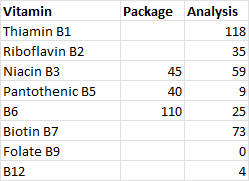
I reached out to Sari Food to ask if their package listed nutritional values for all B vitamins, or if some were omitted.  They confirmed that some were omitted and provided me with a new nutritional analysis that differed significantly from the nutrition reported on the package.  

The new analysis reported 7 B vitamins, compared to the package that only lists 3.  Their analysis showed significant amounts of B1 and B7 that were not listed on the package.  Interestingly, the new analysis also differed from the package for the 3 listed on the package.  I think this shows the variability between different batches of the same product. 

% DV of B vitamins for Sari Nutritional Yeast

Revised Figure showing % DV by brand:


These results increased the average % DV of the 7 brands in my sample for B1 and B7, and decreased the % DV for B6.  This now shows that unfortified nutritional yeast are generally good sources of B1, B2, B3, B5 and B7.  B6 appears to be less common, and I'm not confident that the B9 data is accurate - Sari's new analysis still didn't report any Folate.  Unfortified nutritional yeast is not a good source of B12.

Updated with new analysis from Sari Foods.


Fire Frequency in Arizona Ecosystems


Introduction

How likely a given area is to encounter wildfire is important for planning and wildfire mitigation. Historic or expected fire return statistics are often cited for ecosystems in Arizona, but I was curious how often wildfire actually burns across different Arizona ecosystems.

Figure 1 Example wildfire polygons around Clints Well, AZ showing overlapping fires from newer (blue, labelled), to older (shades of brown, unlabelled).  Data sources include WFIGS and GeoMAC.

Wildfire Data

I used the WFIGS Interagency Fire Perimeter GIS data, which has good data on wildfires from 2000-2023.  I limited this analysis to USFS land in Arizona.

Out of a total of 11.168 million acres of USFS land in AZ, wildfire has burned 4.8 million cumulative acres in the last 24 years.  This counts areas that burned more than once as additional acres.  It includes natural and human-ignitions, as well as wildfire managed for resource benefit.  

Figure 2 Example WFIGS Interagency Fire Perimeters in AZ


Figure 3 Wildfire acreage over time in AZ.  2011 was the Wallow fire.

Vegetation Types

To evaluate wildfire probabilities in Arizona ecosystems, I looked at the 15 most common ecosystem types, as defined by the USFS Ecosystem Response Unit (ERU) vegetation type GIS layer.  Together, these 15 ecosystems account for 9.1 million out of the 11.1 million acres of USFS land in Arizona.

Figure 6 Example ERU polygons showing aspen (pink) and mixed conifer around the San Franscisco Peaks, AZ.

To calculate the percent of each ERU burned per year, I divided total acres burned by total acres of ERU and divided that by 24 years.   Spruce-Fire forest and Mixed Conifer is most likely to burn, whereas Mixed Conifer with Aspen is least likely.  Ponderosa pine ecosystems rank in the middle, at around 3% chance. 

This analysis counts acres more than once if they burned more than once in the 24 year time period.  For example, Spruce Fir Forest ERU has more acres of wildfire than there are total acres of ERU.  This does not mean that every acre burned, but some acres burned more than once.   

ERU

ERU Acres

Wildfire Acres

% burned in 24 years

% burned per year

Ponderosa Pine Forest

1,966,603

1,431,424

72.79%

3.03%

PJ Woodland

1,175,545

208,685

17.75%

0.74%

PJ Evergreen Shrub

1,136,221

311,254

27.39%

1.14%

Mojave-Sonoran Desert Scrub

779,939

386,363

49.54%

2.06%

Semi-Desert Grassland

730,015

300,189

41.12%

1.71%

Interior Chaparral

713,754

533,678

74.77%

3.12%

Juniper Grass

539,830

299,074

55.40%

2.31%

Colorado Plateau / Great Basin Grassland

367,114

41,812

11.39%

0.47%

Ponderosa Pine – Evergreen Oak

362,838

238,365

65.69%

2.74%

Madrean Pinyon-Oak Woodland

354,836

92,160

25.97%

1.08%

Mixed Conifer - Frequent Fire

349,006

304,104

87.13%

3.63%

Mixed Conifer w/ Aspen

242,169

9,782

4.04%

0.17%

Montane / Subalpine Grassland

157,163

92,461

58.83%

2.45%

Spruce-Fir Forest

112,827

124,593

110.43%

4.60%

PJ Grass

96,016

8,995

9.37%

0.39%

Madrean Encinal Woodland

93,939

23,092

24.58%

1.02%

Figure 7 ERU acres, wildfire acres, percent burned in 24 years, and percent burned per year.  Table ranked from most to least common ERU.


Wildfire Return Interval

Fire return interval is the average length of time until fire returns at a given point in the landscape.  The chance that any given acre burns depends on a large number of complex factors, including when it last burned, the topography, fuel reduction treatments, proximity to WUI and/or human use.  Still, percent burned per year in the table above (Wildfire/Year, W) can be used to calculate expected return intervals of fire, all else being equal.

Calculations – Fire per Year

To calculate expected return intervals, first calculate the probability (P) that fire will not occur in a given span of time (X).

P = (1-W)^X

For example, for Ponderosa Pine Forest over 10 years:

P = (1-0.0303)^10

P = (0.9697)^10

P = 73.5% chance that fire will not occur, or 26.5% chance that fire will occur in 10 years.

20 years:

(0.9697)^20=54% chance that fire will not occur, or 46% chance that fire will occur.


Figure 8 Cumulative probability of wildfire in AZ Ponderosa Pine ERU


Calculations – Fire Return Interval

If we determine a Probability, but need to know the span of time until fire occurs, we can solve for X:

P = (1-W)^X

P = log x / log (1-W)

For example, if we determine "expected return interval" to be the length of time necessary for 50% chance of fire:

 0.5  = (0.9697)^X

X = log (0.5) / log (0.9697)

X = 22 years until there is a 50% chance of fire in Ponderosa Pine Forest.

However, if we interpret "expected return interval" to be the length of time necessary for 90% chance of fire:

0.1  = (0.9697)^x

X = log (0.1) / log (0.9697)

X = 75 years until there is a 90% chance of fire in Ponderosa Pine Forest.

Over time, the probability approaches, but never actually reaches, 100% that a wildfire will occur:

Figure 9 Cumulative Probability of Fire in Ponderosa Pine ERU


Conclusion

The length of time until fire returns at a given point in the landscape depends on how certain we want to be of the chance of fire.  If we want to be very certain (90% probability), then we would expect to wait 75 years on average.  If we are OK taking the flip of a coin (50% probability), than we would expect fire to return at any given point in 22 years.  If we are risk adverse, and can only tolerate a 10% chance of fire visiting our chosen point, we should expect fire every 3.5 years, on average.