Showing posts with label graphs. Show all posts

Sunday, September 07, 2025

Reptile Trends in Arizona

Introduction
In my previous posts, I showed that the relative proportion of iNaturalist observations was decreasing for Sonoran Desert tortoises. 

In my second post I investigated whether there were biases affecting the total number of observations, and while I found some, they did not change the results of the first post.  However, in that post I only compared total observations to large taxa that include hundreds of species, like birds, insects, and reptiles.  The question remains of the variability of other individual species besides tortoises.  Is the observed trend in tortoise observations normal or extreme?  

Looking at other individual species is problematic, because while I could assume that the actual populations of large groups of taxa would be relatively consistent over time, that assumption does not hold for individual species.  In other words, it is harder to investigate potential observer biases when looking at individual species because their populations may actually be increasing or decreasing.

Nonetheless, looking at other species can shed some light on the observed trends in tortoise observations.  I looked at other reptiles with the idea that they might have similar trends, and/or similar causes explaining their trends.  

Reptile Observation Trends
I downloaded all Research Grade observations of reptiles within the tortoise study area and decided to focus on species with more than 1,000 observations over the 2013-2024 study period.  There were 26 species that fit this requirement.  

iNat page showing representative reptile species included in this analysis.  

I then conducted a similar analysis to the last blog post.  To look at the changing proportion of observations for each species over time, I divided the number of observations for each species each year by the total number of reptile and total number of non-plant observations for that year.  To compare species to one another, I normalized all species proportions to a base year, either 2013 (to look at % change since 2013) or 2018 (to look at % change since 2018).  

Changes 2013-2024
Excel can only graph 10 measures at a time (due to a limit on the number of colors?), so there are 3 graphs presented below for % change of various reptile species compared to total non-plant observations.  % change compared to other reptiles is not shown, but is summarized in the table below.

Top 10 lizards by total observations:

Plateau fence lizard had large initial increase that continued.
Western side blotched lizard had large increase in 2013 (year 11)
Common side blotched lizard has had increases, but ended very near where it began
Greater earless lizard decreased to 50% by year 5 and then held steady.

Middle 10 reptile species . Sonoran desert tortoise points are highlighted:

Mediterranean house gecko had large increase in first few years, but has decreased again since year 6 (2018)
Sonoran gopher snake has been up and down 50% at different times
All of the other species have decreased.

Bottom few reptile species. Note different Y axis:

Table of top 25 most observed reptile species in study area, listed from most to least observed:

Average change when normalized to total observations in less than 4%, but standard deviation is 50%.
Largest increase was Plateau Fence Lizard 240% change as a % of total observations, and 333% change as a percent of reptiles. Other species with large increases were red-eared slider and western side-blotched lizard.
Largest decrease was Gila Monster, only observed 38% as much in 2024 compared to 2013 total observations, or 52% as much compared to total reptile observations.  Other species with large decreases were Gopher snakes, western banded gecko, and Sonoran desert tortoise.  

The large variability in % change means that the standard deviation is also quite large.  Therefore, few if any of these changes would be statistically significant.   For example, even the large decrease in proportion of gila monster observations is not more than 2 standard deviations from the mean.

It is interesting to note that these results are largely consistent when species are compared against reptiles or all non-plant taxa.  Therefore this analysis does not help explain the apparent decrease of total reptiles compared to all non-plant taxa since 2013 that I noted in my previous blog post.


Changes 2018-2024

To show all species on one graph, I used Tableau to visualize the % change each species.  In this case I am comparing each species to total reptile species, but again I present comparison data for both total reptile and total non-plant observation in the table below.


Summary table:

Average change when normalized to total observations in less than 10%, and less than 1% when compared to just reptiles. but standard deviation is still more than 30%.
Largest increase was western side-blotched lizard with more than 200% change compared to either total non-plant or total reptile observations.   Other species with large increases were long-nosed snake with more than 150% change.

Largest decrease was still Gila Monster, which continued to decline since 2018.  It was only observed 50% as much in 2024 compared to 2018 when compared to total non-plant or total reptile observations.  Other species with large decreases were northern black-tailed rattlesnakes, sonoran desert tortoises, meditgerranean house geckos, and clark's spiny lizard.

Identifications to species versus subspecies can be a source of bias
The large increase in western side blotched lizard, a subspecies of common side blotched  lizard that did not show a large increase, could be due to Identifications favoring the subspecies.  Same could be true for Sonoran Gopher snake, a subspecies of gopher snake that showed a decrease.  The increase/decrease between the subspecies and species could be due to a cultural shift as identifiers increasingly favor the use of the subspecies.   Note that Northern black-tailed rattlesnake is also a subspecies (of Western black tailed rattlesnake), but almost all of the observations in AZ are consistently identified to the subspecies, so the large decrease in observations of this subspecies is probably not due to identifier bias.

Conclusions
While tortoise was not statistically different from all other reptiles, its decline is among the largest, grouped with other species of conservation concern.

For changes across reptiles, there are several possible hypotheses for the observed changes.  Some species are probably actually increasing or decreasing.  Species increasing in places people live would be observed more often.  But:  even if that is generally true, it is not consistently true.  Otherwise most common species would consistently increase and least common would consistently decrease.

I rejected my hypothesis that common reptiles are observed more and less common are now observed less frequently.  However, there does seem to be more variability in less observed species.  This is why I set the lower limit for this analysis at 1,000 total observations.  Even 1,000 isn’t very many, just 100-200 observations/year.  These small sample sizes could explain some of the variability.

Thursday, September 26, 2024

Fire Frequency in Arizona Ecosystems


Introduction

How likely a given area is to encounter wildfire is important for planning and wildfire mitigation. Historic or expected fire return statistics are often cited for ecosystems in Arizona, but I was curious how often wildfire actually burns across different Arizona ecosystems.

Figure 1 Example wildfire polygons around Clints Well, AZ showing overlapping fires from newer (blue, labelled), to older (shades of brown, unlabelled).  Data sources include WFIGS and GeoMAC.

Wildfire Data

I used the WFIGS Interagency Fire Perimeter GIS data, which has good data on wildfires from 2000-2023.  I limited this analysis to USFS land in Arizona.

Out of a total of 11.168 million acres of USFS land in AZ, wildfire has burned 4.8 million cumulative acres in the last 24 years.  This counts areas that burned more than once as additional acres.  It includes natural and human-ignitions, as well as wildfire managed for resource benefit.  

Figure 2 Example WFIGS Interagency Fire Perimeters in AZ


Figure 3 Wildfire acreage over time in AZ.  2011 was the Wallow fire.

Vegetation Types

To evaluate wildfire probabilities in Arizona ecosystems, I looked at the 15 most common ecosystem types, as defined by the USFS Ecosystem Response Unit (ERU) vegetation type GIS layer.  Together, these 15 ecosystems account for 9.1 million out of the 11.1 million acres of USFS land in Arizona.

Figure 6 Example ERU polygons showing aspen (pink) and mixed conifer around the San Franscisco Peaks, AZ.

To calculate the percent of each ERU burned per year, I divided total acres burned by total acres of ERU and divided that by 24 years.   Spruce-Fire forest and Mixed Conifer is most likely to burn, whereas Mixed Conifer with Aspen is least likely.  Ponderosa pine ecosystems rank in the middle, at around 3% chance. 

This analysis counts acres more than once if they burned more than once in the 24 year time period.  For example, Spruce Fir Forest ERU has more acres of wildfire than there are total acres of ERU.  This does not mean that every acre burned, but some acres burned more than once.   

ERU

ERU Acres

Wildfire Acres

% burned in 24 years

% burned per year

Ponderosa Pine Forest

1,966,603

1,431,424

72.79%

3.03%

PJ Woodland

1,175,545

208,685

17.75%

0.74%

PJ Evergreen Shrub

1,136,221

311,254

27.39%

1.14%

Mojave-Sonoran Desert Scrub

779,939

386,363

49.54%

2.06%

Semi-Desert Grassland

730,015

300,189

41.12%

1.71%

Interior Chaparral

713,754

533,678

74.77%

3.12%

Juniper Grass

539,830

299,074

55.40%

2.31%

Colorado Plateau / Great Basin Grassland

367,114

41,812

11.39%

0.47%

Ponderosa Pine – Evergreen Oak

362,838

238,365

65.69%

2.74%

Madrean Pinyon-Oak Woodland

354,836

92,160

25.97%

1.08%

Mixed Conifer - Frequent Fire

349,006

304,104

87.13%

3.63%

Mixed Conifer w/ Aspen

242,169

9,782

4.04%

0.17%

Montane / Subalpine Grassland

157,163

92,461

58.83%

2.45%

Spruce-Fir Forest

112,827

124,593

110.43%

4.60%

PJ Grass

96,016

8,995

9.37%

0.39%

Madrean Encinal Woodland

93,939

23,092

24.58%

1.02%

Figure 7 ERU acres, wildfire acres, percent burned in 24 years, and percent burned per year.  Table ranked from most to least common ERU.


Wildfire Return Interval

Fire return interval is the average length of time until fire returns at a given point in the landscape.  The chance that any given acre burns depends on a large number of complex factors, including when it last burned, the topography, fuel reduction treatments, proximity to WUI and/or human use.  Still, percent burned per year in the table above (Wildfire/Year, W) can be used to calculate expected return intervals of fire, all else being equal.

Calculations – Fire per Year

To calculate expected return intervals, first calculate the probability (P) that fire will not occur in a given span of time (X).

P = (1-W)^X

For example, for Ponderosa Pine Forest over 10 years:

P = (1-0.0303)^10

P = (0.9697)^10

P = 73.5% chance that fire will not occur, or 26.5% chance that fire will occur in 10 years.

20 years:

(0.9697)^20=54% chance that fire will not occur, or 46% chance that fire will occur.


Figure 8 Cumulative probability of wildfire in AZ Ponderosa Pine ERU


Calculations – Fire Return Interval

If we determine a Probability, but need to know the span of time until fire occurs, we can solve for X:

P = (1-W)^X

P = log x / log (1-W)

For example, if we determine "expected return interval" to be the length of time necessary for 50% chance of fire:

 0.5  = (0.9697)^X

X = log (0.5) / log (0.9697)

X = 22 years until there is a 50% chance of fire in Ponderosa Pine Forest.

However, if we interpret "expected return interval" to be the length of time necessary for 90% chance of fire:

0.1  = (0.9697)^x

X = log (0.1) / log (0.9697)

X = 75 years until there is a 90% chance of fire in Ponderosa Pine Forest.

Over time, the probability approaches, but never actually reaches, 100% that a wildfire will occur:

Figure 9 Cumulative Probability of Fire in Ponderosa Pine ERU


Conclusion

The length of time until fire returns at a given point in the landscape depends on how certain we want to be of the chance of fire.  If we want to be very certain (90% probability), then we would expect to wait 75 years on average.  If we are OK taking the flip of a coin (50% probability), than we would expect fire to return at any given point in 22 years.  If we are risk adverse, and can only tolerate a 10% chance of fire visiting our chosen point, we should expect fire every 3.5 years, on average.

Thursday, March 23, 2023

Climate Prediction Skill

The US Climate Prediction Center issues forecasts beyond the normal National Weather Service's 10-14 day window.  They provide weekly and monthly forecasts out to 3 months.  Given the timeframe and the fact that their forecasts cover the entire contintental US, its not surprising that the forecasts are often wrong.  But how wrong?  And is their skill improving over time?

I analyzed their 3 month temperature and precipitation forecast skill using data provided on their "Gridded Seasonal Verifications" webpage.  

Note that skill is measured on a scale from -50 to 100, where -50 would be a forecast that was exactly wrong in every area, 0 would be a prediction that did no better than chance, and 100 is a prediction that was exactly right in every area.  


They provide data starting in 1995.  Since that time in the mid 1990's, linear trendlines show that their forecast skill has slightly improved for both Temperature and Precipitation.  Precipitation skill started out lower, but has almost doubled (from 10 to 20) while Temperature skill started higher but has not increased as much (from 22 to 28).

However, the last 10 years have not been as successful:


Since 2012, neither Precipitation nor Temperature skill have increased.  In fact, mean temperature forecast skill has decreased markedly since 2018.  Before that, Temperature skill had been doing quite well in the period 2014-2018.  It is not clear what changed in 2018.  A similar transition may be happening with Precipitation, where the period 2019-2022 saw consistently good predictions, but since the beginning of 2023 the forecast skill has fallen off a cliff.

With increased use of machine learning, it seems likely that long-term weather forecast skill should increase.  However, complex chaotic weather patterns are most impactful to climate predictions in the 1-3 month time frame, so this area of weather/climate prediction may continue to have lower than hoped for success.  


Tuesday, January 11, 2022

Phenology, Accumulated Growing Degree Days, and Soil Moisture

US Crop Calendar

Source: https://ipad.fas.usda.gov/countrysummary/Default.aspx?id=US


Arizona had a good year for NDVI

Source: https://glam1.gsfc.nasa.gov/


NASA SMAP data.  Data is global.


This mapped layer is delayed by 2 weeks.  I haven't found a layer that shows real-time moisture.


NPN Visualization tool can view Historical, Current, and Anomaly Accumulated Growing Degree Days. Data is only for USA.

Source: https://data.usanpn.org/vis-tool/#/explore-phenological-findings


Saturday, September 26, 2009

Calibrating Bank Full Measurements Using Regional Curves and USGS Stream Guage Data

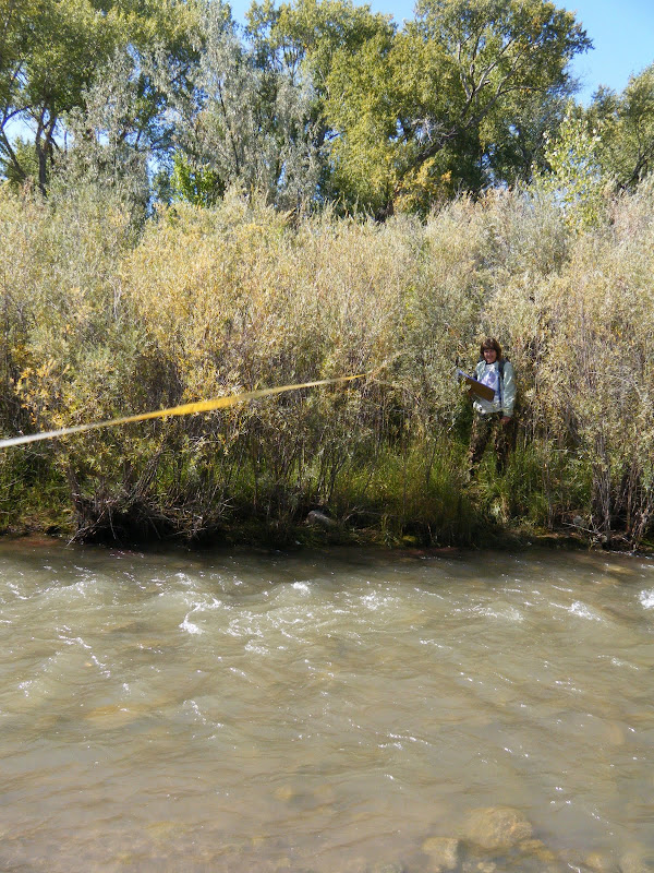
Bankfull is important to fluvial hydrogeomorphology (HGM) because it often determines the shape of the channel by moving and depositing sediment. Bankfull (BF) is defined as the high water level that recurs every 1 - 2 years, but measuring it in the field involves using multiple indicators in a 'preponderance of evidence' detective-style approach.

Most plants that cannot tolerate saturated soil conditions for days at a time, like Alders, will not grow below BF, while willows and cottonwood can. Also, the top of point or side bars can indicate the height of BF, but on the Rio Embudo, near Dixon NM, BF indicators were contradictory and hard to find. Is BF just a few centimeters above the base-flow water, or are all the willow below BF?
From Rio Embudo at Dixon, NM Hydrology Analysis
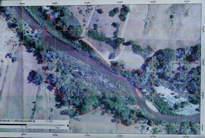
A number of bars and scour features at different heights further compounded the mystery. It was time to seek out other clues. One source of potential indicators was our aerial imagery, which was taken during Spring runoff, 2008:
From Rio Embudo at Dixon, NM Hydrology Analysis
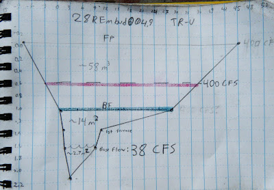
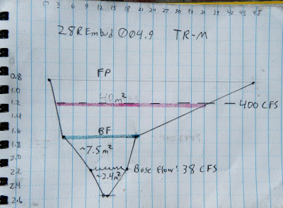
The point bars at bottom right are bisected by a side channel that is several feet above the base level today. That means BF must be at least that high, and would probably inundate most of the willows. Corroborating this, the landowner reports that the willows are indeed flooded almost every year. But exactly how high is BF? To gather more data, we surveyed three channel cross sections, or transects (TR), noting the heights of the major terraces.

TR-Upper
From Rio Embudo at Dixon, NM Hydrology Analysis


TR-Middle
From Rio Embudo at Dixon, NM Hydrology Analysis

Tr-Lower
From Rio Embudo at Dixon, NM Hydrology Analysis

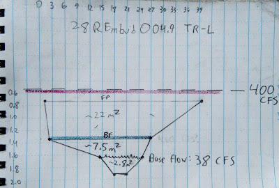
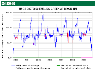
On each of these cross sections we marked where the current base flow water level is, where we think BF is, and where we think Flood Prone (FP) might be. To check these guesses, we correlated those heights with flow data from a USGS gauge just downstream:
From Rio Embudo at Dixon, NM Hydrology Analysis
From this graph we could see that the high water level with recurrence every 1 -2 years is about 400 cubic feet per second (CFS). We could also see that the current flow was about 38 CFS. If the Rio Embudo is flowing with 38 CFS today, how high would a BF flow of 400 CFS be?

between the flow today and BF flow. To figure that out we might need to correct for any changes in the velocity (feet/second). Manning's Equation:

shows that velocity V is proportional to a constant, u, inversely proportional to a coefficient of friction, n, varies to the 2/3 power of channel cross-sectional area, R, and to the 1/2 power of slope, S. Since neither slope nor the constant would change, we can discount them and focus on n and R; n will likely increase because the willows will act like a series of giant combs, increasing friction, and R will also obviously have to increase. For example, doubling the height of the water would multiply that term by 1.6. Unfortunately, coefficients of friction need to be experimentally determined, so we can only guess at n. To make things easier, I decided friction would also increase by a factor of 1.6, to exactly cancel out R. In other words, I don't think the velocity would change by much.

So it is a simple matter of geometry to calculate the cross-sectional area that would correspond to 400 CFS on our cross sections (red lines on the cross-sections, above). Without exception, this height is higher than our field-determined BF (green lines on the cross-sections, above) and, at least for TR-L, even higher than our FP height.

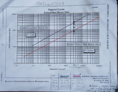
But is this right? Are we getting closer to the truth? To check, we can calibrate our answers for the Rio Embudo against data published by Natural Channel Design on a large number of other Southwestern rivers:
From Rio Embudo at Dixon, NM Hydrology Analysis
I plotted both our field-determined BF cross-sectional area (green points) and the USGS-determined BF cross-sectional area (red points) on the regional curve above. The green points seem to fall on the line for New Mexico, while the red points fall on the Arizona line, corroborating our field measurements and casting doubt on the USGS. However, the watershed above Dixon is very impermeable and could behave more like AZ than NM. I think the true value is probably somewhere in-between the field and USGS values.

This line is probably as close as any to Bankfull:
From Rio Embudo at Dixon, NM Hydrology Analysis