Showing posts with label graph. Show all posts

Saturday, January 31, 2026

DNA Barcodes, Klee Diagrams, and the Secrets of Speciation

Modern biodiversity detectives have found new ways to synthesize massive amounts of sequence data into clear information and insights. Two powerful tools to help visualize and understand the structure of life are DNA barcodes and Klee diagrams. Mark Stoeckle and David Thaler pioneered the use and explanation of these tools to offer insights into how species originated and evolved.

What is a DNA Barcode?

A DNA barcode is a short, standardized segment of the genome used for species identification. In the animal kingdom, the gold standard is a 648-base pair (bp) segment of the mitochondrial cytochrome c oxidase subunit I (COI) gene. While this segment represents less than one-millionth of an organism’s total genome, it has proven remarkably effective because mitochondrial DNA clusters largely overlap with species as defined by experts.

This tool is commonly used in eDNA samples to identify species from the environment. The BOLD (Barcode Of Life Database) now contains approximately five million of these barcodes, covering about 100,000 animal species. Interestingly, there is nothing inherently “special” about the COI gene biologically; it became the standard because reliable primers were adopted by a critical mass of the scientific community.

Visualizing Life: The Klee Diagram

To make sense of these millions of sequences, scientists developed the Klee diagram, a heat map that displays correlations between DNA sequences. In these diagrams, every sequence is compared with every other sequence, and the intersections are color-coded to show similarity. (Sirovich, Lawrence, Mark Y. Stoeckle, and Yu Zhang. “Structural analysis of biodiversity.” PLoS One 5.2 (2010))
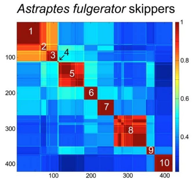
Species-level clusters in skipper butterfly Astraptes fulgerator COI barcode Klee diagram. Sequence clusters appear as blocks of high correlation along the diagonal and correspond to the 10 provisional species (1. INGCUP, 2. HIHAMP, 3. FABOV, 4. BYTTNER, 5. YESENN, 6. LONCHO, 7. LOHAMP, 8. SENNOV, 9. CELT, 10. TRIGO). Block sizes reflect number of sequences per species (n 3–88). Stoeckle and Coffran 2013.

Key features of Klee diagrams include:

• Indicator Vectors: Each DNA sample is listed on both the x and y axis and a heat map is generated comparing each species to itself (red=1, a perfect match) and all of the other samples in the database.

• Species Islands: When sequences are arrayed, species appear as sharp, non-overlapping squares. This visualization confirms that species are “islands in sequence space,” with distinct clusters and empty gaps between them.

• Scalability: Recent software developments like PyKleeBarcode allow these diagrams to be computed for very large datasets, potentially representing the whole animal kingdom in a single information space.
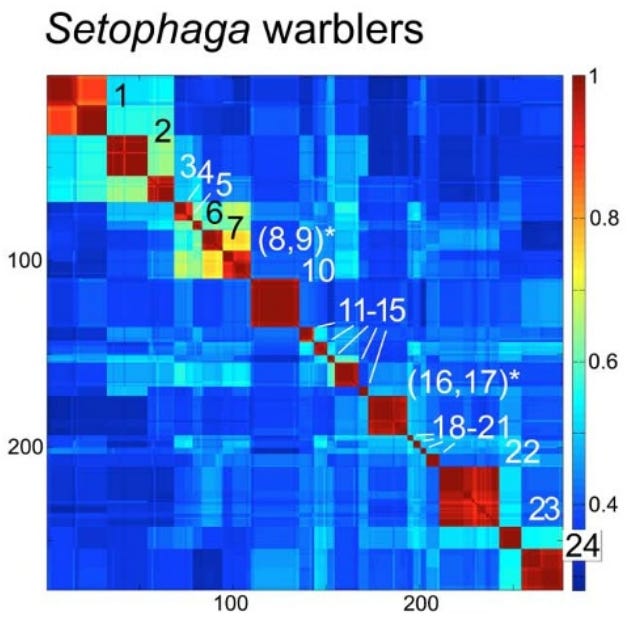
Species-level clusters in birds: Setophaga warblers COI barcode Klee. Blocks along the diagonal correspond to species; species with shared blocks are marked with an asterisk (1. petechiae, 2. striata, 3. pensylvanica, 4. nigrescens, 5. graciae, 6. discolor, 7. virens, 8. occidentalis,* 9. townsendi,* 10. magnolia, 11. tigrina, 12. castanea, 13. dominica, 14. palmarum, 15. citrina, 16. americana,* 17. pitiayumi,* 18. cerulea, 19. pinus, 20. kirtlandii, 21. fusca, 22. coronata, 23. caerulescens, 24. ruticilla). Stoeckle and Coffran 2013.

Evolutionary Implications: Why Mitochondria Define Species

A long controversy in biology concerns whether species are “real” or just human constructs. Dobzhansky, in his 1937 book Genetics and the Origin of Species, claimed that “Biological classification [of species] is simultaneously a man-made system of pigeonholes devised for the pragmatic purpose of recording observations… and an acknowledgement of the fact of organic discontinuity.”

Stoeckle and Thaler, in their 2018 paper “Why should mitochondria define species?”, expand on the evolutionary meaning behind these barcode clusters. They argue that the patterns seen in DNA barcodes are central facts of animal life that evolutionary theory must explain.

1. The “Barcode Gap” and Low Intraspecific Variation: Across the animal kingdom, the average pairwise difference (APD) within species is typically very low, between 0.0% and 0.5%. Meanwhile, the distance between even the most closely related species is usually 2% or more. This “gap” exists because intermediates between clusters are absent or rare.

2. The Neutrality of Synonymous Mutations: Most variation within and between these barcode clusters consists of synonymous substitutions; mutations that change the DNA sequence but not the resulting protein.

Stoeckle and Thaler argue that these changes are selectively neutral in mitochondria. This is because animal mitochondria are simpler than the nuclear genome; they lack introns (and thus splicing) and only have 22 different tRNA types. This lack of complexity means synonymous codons are less likely to affect the “fitness” of the organism, allowing them to accumulate as a “molecular clock”.

However, observed patterns of variation in DNA barcodes do not match the predictions of Kimura’s Neutral evolutionary theory of random accumulation of mutations.
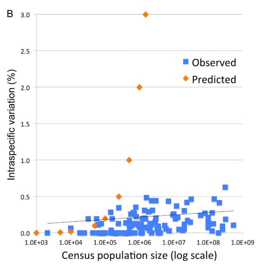
Intraspecific variation and population size among 111 bird species with census estimates; species with geographic or hybrid clusters were excluded. Orange markers indicate predicted variation for a model species under neutral evolutionary drift. Stoeckle and Thaler 2014.

3. A Recent Universal Expansion? To reconcile these observations, Stoeckle and Thaler’s use humans as a case example. Modern humans have an APD of 0.1%, which is about average for the animal kingdom.

Several lines of evidence suggest that human mitochondria originated from a state of uniformity approximately 100,000 to 200,000 years ago before expanding. Stoeckle and Thaler propose that the extant populations of humans, and almost all other animal species, arrived at a similar result due to a similar process of expansion from mitochondrial uniformity within the same recent geological timeframe.
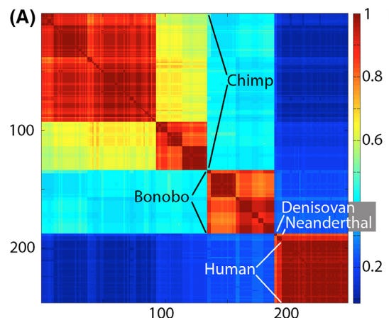
Klee diagram of mitochondrial genetic diversity of humans and our closest living and extinct relatives. The human sequences represent the span of known modern diversity. The Klee diagram heat map demonstrates greater mitochondrial diversity among chimpanzees and bonobos than among living humans. Thaler and Stoeckle 2016.

This coincides with Mayr’s 1942 idea that bottlenecks followed by expansion could explain speciation:

“The reduced variability of small populations is not always due to accidental gene loss, but sometimes to the fact that the entire population was started by a single pair or by a single fertilized female. These “founders” of the population carried with them only a very small proportion of the variability of the parent population. This “founder” principle sometimes explains even the uniformity of rather large populations…”
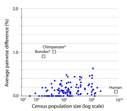
Mitochondrial genetic diversity, represented as average pairwise difference of COI barcodes, in relation to census population size in humans, chimpanzees, and bonobos compared to a well characterized set of birds (Stoeckle and Thaler 2014). Mitochondrial genetic diversity in humans is about 0.1%, less than that of many bird species, despite having more than 10-fold greater population than the most abundant bird in this dataset. Chimpanzees and bonobos have much smaller population sizes than humans, but conspicuously higher diversity, consistent with reproductively isolated subgroups. Thaler and Stoeckle 2016.

Conclusion

DNA barcodes and Klee diagrams do more than just identify species; they reveal a kingdom-wide pattern of organic discontinuity. Whether through population bottlenecks, lineage sorting, or gene sweeps, the uniform low variance across species suggests that the “islands” of biodiversity we see today are the result of deep evolutionary currents that affect all animals—from humans to birds to insects—in a surprisingly similar way.

Thaler and Stoeckler conclude their 2018 paper by noting that “there is irony but also grandeur in this view that, precisely because they have no phenotype, synonymous codon variations in mitochondria reveal the structure of species and the mechanism of speciation.”

Annotated Bibliography

Sirovich, Lawrence, Mark Y. Stoeckle, and Yu Zhang. “Structural analysis of biodiversity.” PLoS One 5.2 (2010): e9266.

- lays out math and originally defines “Klee diagrams”. Some examples.

Stoeckle, Mark Y., and Cameron Coffran. “TreeParser-aided Klee diagrams display taxonomic clusters in DNA barcode and nuclear gene datasets.” Scientific Reports 3.1 (2013): 2635.

- short and sweet version for Nature. Butterly and Warbler Klee examples.

Stoeckle, Mark Y., and David S. Thaler. “DNA barcoding works in practice but not in (neutral) theory.” PLoS one 9.7 (2014): e100755.

- first paper to note that the observed patterns in Klee diagrams, of homogenous species, doesn’t match neutral theory. OK.

Thaler, David S., and Mark Y. Stoeckle. “Bridging two scholarly islands enriches both: COI DNA barcodes for species identification versus human mitochondrial variation for the study of migrations and pathologies.” Ecology and Evolution 6.19 (2016): 6824-6835.

- short but good paper, cool data on humans, bonobos, and chimps, and comparison to results from their 2014 paper disproving neutral theory. Human/Chimp Klee example.

Stoeckle, Mark Y., and David S. Thaler. “Why should mitochondria define species?.” BioRxiv (2018): 276717.

- deep dive analysis that builds on 2014 observation that mitochondrial DNA barcodes don’t match expectations of neutral theory (”Species are islands in sequence space.”), while at the same time appearing to be created by neutral (synonymous) sequence changes. This is explained by evolutionary mechanisms of speciation, which has implications for how recent most species have become species. These results also help to resolve some of the disagreements about the definition of a species.

Duchemin W, Thaler DS (2023) PyKleeBarcode: Enabling representation of the whole animal kingdom in information space. PLOS ONE 18(6): e0286314.

- methods paper

Tuesday, May 13, 2025

What's up with iNat in Japan?

I recently listened to a fascinating podcast about the naturalist community in Japan, specifically about their interest in entomology. However, when I look at iNaturalist statistics for Japan, there appear to be very few observations/observers/identifiers given the population and level of development. 


This figure shows the number of Observations, Observers, and Identifiers versus per capita GDP for select countries that have similar populations. Japan (red X) is way below the trend lines for all 3 metrics.  Mexico (green asterisk) is way above trend.

Interestingly, South Korea (blue triangle) clusters with Japan, although South Korea has a population that is less than 1/2 that of Japan.


Japan clusters with the Philippines and Egypt based on population.  Interestingly, the trend lines for iNat statistics and total population are not as consistent as per capita GDP.  (China is excluded from the chart above and the one below because its population is an outlier compared to the other countries.)

This chart shows total GDP versus Observations, Observers, and Identifiers.  Japan is a clear outlier in the bottom right corner with a high GDP but low iNat statistics.

Conclusions

In this dataset, the strongest r value was Observers versus per capita GDP.  The second highest was Identifiers versus Total GDP.  The lowest was Observers versus Total Population.  This is consistent with the hypothesis that level of development (as measured by GDP) is the strongest predictor of iNat usage. 

For an interactive version of these charts on Tableau Public, use this link: https://public.tableau.com/app/profile/alexandra.permar/viz/iNatCountryComparison/

Wednesday, January 22, 2025

iNat Isn't Slowing Down in Arizona

The iNaturalist website collects species observations from people all over the world.  It started in 2008 and grew slowly at first and then entered a period of rapid growth in 2017.  As a consequence, the number of species recorded on the website is constantly increasing, passing 300,000 in 2020.  The website is currently adding more than 50 million observations a year. This raises an interesting biodiversity question: how long can the number of species keep increasing?  Another way of stating the question: how many species are there?

Biodiversity scientists use species accumulation curves to estimate the total number of species in a given area.  As they investigate a new study site, they record new species and the date/time the species was observed.  For most sites, the number of new species increases rapidly as scientists describe common species; the number of new species slows as scientists search for more and more rare species.  Graphing the number of species over time should reveal a logarithmic curve.  Based on the equation for that curve, scientists can estimate the asymptote - the number of species the curve will eventually reach given enough time.  This allows scientists to estimate the total number even if they don't finish counting all of the species.


This slowing down does seem to be happening for total species count on iNat.  For example, the 2024 Year in Review showed 50 million observations over the year, and about 1,000 new species (not previously observed and posted to iNat) per month.  

From iNat 2024 Year in Review

In contrast, back in May 2019 more than 6,000 new species were added.  It appears that 2019-2020 was the peak for adding new species, and even as more new users have joined iNat, fewer and fewer new species are being observed.  

These charts show running totals, with new additions colored, so that the logarithmic curve is more visible in Newly Added Species:

From 2024 Year in Review

There were fewer observations and many fewer users in 2019-2020, than now, but the rate of newly added species was much greater.  This appears to indicate that it is getting harder and harder to find new species to add to iNat.  Observable species on iNat are those that can be distinguished with photographic evidence, usually limited to smartphone cameras.  So this estimate does not include microbial life, and probably excludes most microscopic life.  

Its possible that unobserved species are mostly in the middle of remote wilderness areas and that is why fewer and fewer are being observed.  But many of the new species are from the US and Europe - there's still lots to explore!

For example, in Arizona the species accumulation curve is still effectively linear, with about 700 new species each year.  No signs of slowing down here!


The same is true of smaller areas within AZ, for example the Prescott National Forest averages 186 new species observed each year.  

I considered whether the new species could be due to rare birds and insects showing up for the first time.  I also analyzed new plant taxa on Coconino National Forest.  Plants are well-studied and the forest has been extensively surveyed, so it seems unlikely that new species would be discovered yearly.  But, according to the iNat data, not only are new species being continuously discovered, there is no detectable slow down in the rate of discovery!


I'm not sure what conclusions to draw from this analysis.  The standard conclusion would be that we haven't sampled enough species yet to begin to see the rate of new species discoveries slowing down.  This implies that the total number of species is quite a bit greater than the number that have been recorded so far on iNat.  

Another interpretation could be that the actual number of species isn't constant.  In other words, there could be new plants showing up each year on the Coconino.  This could be due to new invasive species, shifting distributions of native species.  It could also be impacted by taxonomist naming conventions; the number of species in even well-explored areas could increase as botanists work to name and describe the huge floristic diversity of the world.

There is still a lot of biodiversity to explore, even in our backyards!

Friday, April 26, 2024

Rangeland Analysis Platform

New data source for In-Season NDVI:  Rangeland Analysis Platform. (RAP) https://rangelands.app/rap/ 

RAP allows mapping of Cover and Biomass, and generates reports for an Area of Interest for Cover, Annual biomass, and 16-day biomass.  I'm hopeful they will upgrade the map to include 16-day biomass.  If they did, I could add it to the comparisons of the other NDVI sources.  Mapping would allow in-season management decisions based on forage production.


Case Example: Dugas, AZ

This series of years from 2018-2023 shows the variability in biomass production by season in a desert grassland at mid-elevation (4,000 ft) in AZ:


2018 shows a drought year, when there was little to no spring green-up due to a lack of winter precipitation, and a low green-up in response to summer monsoons.

2019 and 2020 were the "nonsoon" years, when the summer monsoons failed to materialize.  However, because the winter rains were good in 2019 and exceptional in 2020, total production was high.

2021 and 2022 show the potential for growth in years of good monsoon rains.  2023 shows a "normal" year with bimodal peaks in production corresponding to the spring green-up peaking in late March, and the summer monsoons peaking in mid-August.  However, for some reason this year had almost no annual biomass production associated with the monsoon.  Each year is different!

----

Case Example: Congress, AZ

This series from around Congress, AZ shows the extreme variability of plant growth in the Sonoran desert (2,500 ft).

In drought years like 2018 and 2022, there is almost no plant growth, whereas the extreme winter precipitation year of 2020 annuals produced almost 130 pounds/acre of spring growth.  None of the years hadmuch perennial herbaceous production, and monsoons inconsistently produce up to 40 pound/acre of growth in good years.  


----

Case Example:  Grand Canyon Junction 

SR-64 and SR 180 intersection, just south of Grand Canyon high-elevation grassland (6,000 ft).


Maximum production compared to the lower elevation sites is lower, only reaching 50 pounds/acre in good years.   However, total annual production is usually more consistent.  There is still the potential for bimodal production peaking in the late spring (early June) (2023 and 2017, not shown) and in the monsoons.  The monsoon peak seems to be most consistent, except in 2019 and 2020 when the monsoons failed - luckily those years had relatively good spring growth.   

In contrast to the low desert site, annual production (red) is usually less important than perennial production (green) at this site:


Wednesday, December 01, 2021

2000-2021 Drought in the Southwest


The list of Drought Impacts:

D0  Forage is limited; soil is dry

Fire risk increases

D1 Plants are stressed; hillsides are unusually brown

Stock ponds and creeks are nearly dry; some springs are dry

D2 Water and feed are inadequate for livestock

Fire danger is high; fire crews are mobilizing

Little forage remains for wildlife; pine trees are losing needles

D3 Ranching operations are affected

Fire preparedness increases; fire restrictions are implemented early

Skiing tourism is low; snowpack is extremely low

Wildlife encroach on developed areas in search of food and water

Native plants are stressed

Livestock do not have adequate water; runoff is short; conditions are dusty

D4 Fire restrictions increase; large fires occur year-round

Vegetation green-up is poor; native plants are dying

Lakes, ponds, and streams are dry

Wednesday, September 08, 2021

Fitbit Data Analysis: HRV and Temperature

 Comparison

Between April/May 2020 and August/September 2021....

    .... my resting HR went from average 52.4 to 55.3

    .... my deep sleep went from average 75.6 to 91.5 minutes


Nightly HRV analysis

Night of Sep 4-5th:  Morning HRV was 62 in Elite HRV, 82 in ithlete, 41 in Fitbit, and 64 in HRV logger.  


Night of Sep 5-6th: Elite HRV was 66, ithlete was 82, Fitbit was 51, HRV logger was 54.  94% of time HR was below resting.  


Sep 6th-7th (but only 6th is shown, due to not downloading Sep 7th data yet...)

Comparison of cheststrap (30 sec sample data smoothed to 5 minute window, Fitbit HRV sampled on 5 minute intervals).  Fit looks pretty good.


Recently found out Fitbit records temperature as well.  There is a diurnal rhythm, with interesting variations.  Sep 4th and 7th were both early morning outdoor exercise (jogging and hiking, respectively).  


More temperature details:

The Inspire 2 temperature sensor is at least directionally-accurate!

The nightly data ("Computed Temperature" file) has what looks like temperature in Celsius. For me, it is 31-32 Celsius at night, which is around 90 F. This is the data that is reported as Skin Temperature in Health Metrics.

Interestingly, there is also continuous 24 hour temperature data at 1 minute intervals ("Device Temperature" file). This data appears to be recorded as variation (+/-) from some baseline, as the numbers are always between +3 and -8 for me. Again, probably Celsius. I plotted my data from the last few days, and the times when I was exercising outside in the sun were consistently +2 degrees above other times that I would guess were cooler.

I don't know if the temperature measures are absolutely correct, but they do at least make sense and could potentially be used to identify unexpected temperature anomalies.

If anyone else is trying to download their data, note that you have to request it on the Fitbit account setting website, and then confirm the email.


Wednesday, September 01, 2021

HRV: ithlete versus elite HRV

 I tested 2 apps to record morning HRV.  I used both apps first thing in the morning for 2 weeks, alternating which app I used first.  There are several different measures of HRV, and I used rMSSD because it was common between the 2 apps and is commonly used to report HRV.

I got very different HRV values for the 2 apps.  


Elite HRV measured a lower mean HRV that was much less variable than My Ithlete.  The latter uses a shorter (1 minute) measurement window versus Elite (2 minutes, after calibration).

Am I missing something?


Thursday, February 27, 2020

Ponderosa Mortality After Fire

The best data comes from Hull Sieg, Carolyn, et al. "Best predictors for postfire mortality of ponderosa pine trees in the Intermountain West." Forest Science 52.6 (2006): 718-728.

This graph shows probability of death based on both “crown consumption” (actual burning of the crown) and “crown scorch” (browning of needles due to heat injury). It shows that probability of tree death increases above 50% when Crown Scorch increases past 75%, whereas tree death is above 50% when crown consumption is only 25%. A combination of the two is determined to be the best predictor of tree mortality.


Here are some diagrams of crown scorch and crown consumption. In general, if there are brown needles on the tree that is scorch, if they are black or missing it is consumption.


(from Tree and forest restoration following wildfire by Peter Kolb)

Monday, January 04, 2016

Ideal Amount of Potassium and Sodium Consumption to Minimize Mortality.

In the spirit of the type of analyses presented in the Perfect Health Diet, I wanted to post some correlations that appear to imply causation.  These two graphs plot Potassium and Sodium Excretion (which is assumed to be a good proxy for intake, assuming people in the study were at steady-state) versus the Odds Ratio of mortality. The odds ratio is a normalized measure of the probability of death.


The first graph illustrates that in this sample, the more potassium consumed (and hence excreted), the lower the odds ratio of mortality.


The second graph illustrates that mortality is higher for those consuming both more than, and less than, 4 g of Sodium per day.  Interestingly, the increase in mortality risk increases more slowly above 4 g/day than it does below 4 g/ day, suggesting that consuming slightly more than 4 g/ day is healthier than consuming slightly less than 4 g/day.

I think these types of analyses could be used to set standards for a whole range of vitamins, minerals, and perhaps other "Goldilocks" substances.  Goldilocks substances are things which are healthy in moderation, but either too much or too little can be harmful or hazardous.  Obviously, some substances such as toxins and radiation are inherently harmful, even down to the smallest dose (but see hormesis theory).

Source.  Urinary Sodium and Potassium Excretion, Mortality, and Cardiovascular Events N Engl J Med 2014; 371:1267 September 25, 2014.  This study looked at over 100,000 people from dozens of countries.

Wednesday, January 07, 2015

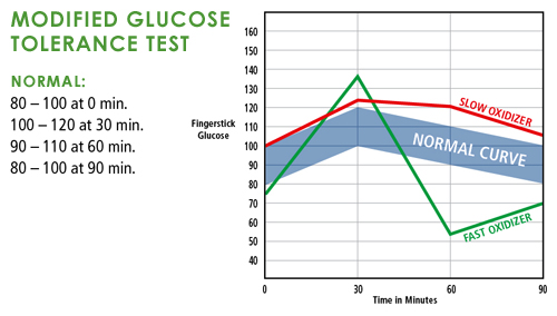
Blood Glucose Charts


From wikipedia article on diabetes.


======
Interesting behavioral health article on hypoglycemia and anger, violence.  
=====
Fast versus slow oxidizers (=induced hypoglycemia).  This website basically recommends eating more fat and protein if you have these below-normal glucose excursions.

Wednesday, November 12, 2014

Comparative Physiology: Maximum Lifespan

A conundrum if the amino acid methionine is a determinant of maximum lifespan: Why do carnivores and vegetarians live the same? Perhaps it could be for different reasons.... antinutrients for the latter and methionine for the former. These are universal rules that apply even between disparate physiologies. I haven't been able to find any papers that examine methionine diet content versus longevity.
SourceEcology and mode-of-life explain lifespan variation in birds and mammals, Proceedings of the Royal Society BDOI: 10.1098/rspb.2014.0298


This is a valuable resource on important "carninutrients" lacking in vegetarian diets.  

Friday, January 24, 2014

Hydrophobic soils after fire? All soils are more or less hydrophobic...

As explained by "Geomorphology: Themes and Trends".  The book is worth it just for the classic essay on erosion and runoff.  A combination, it turns out, of pore size and particle characteristics.

These images are from Chapter 5, "Geomorphological processes, soil structure, and ecology" written by A.C Imeson.  Yes, the x-axis is scaled as square-rooted minutes.
Plant roots can change both the permeability and wettability of soil (as well as many other qualities).  For more information, read Reid, TB and Goss, MJ. 1981.  Effect of living roots of different plant species on the aggregate stability of two arable soils.  Journal of Soil Science.
The book also has a chapter on the Geomorphology of stream channels and craters on Mars!

Monday, January 28, 2013

Current data shows biosphere carbon uptake holding steady

One of the biggest questions for ecosystem scientists is the degree to which terrestrial and marine ecosystems  can continue to sequester carbon in the face of continuing human emissions of CO2 and accompanying global climate change.
This is one of the best (i.e. easiest to interpret) graphs to show that the fraction of emitted CO2 remaining in the atmosphere (i.e. not sequestered) has held steady at around 50% for the last 40+ years (purple line, "Airborne Fraction").  Data Sources: Fossil fuel CO2 emissions - Land use CO2 emissions -  Airborne CO2 levels Graph by Willis Eschenbach.

Similar conclusions were reached by the National Oceanic and Atmospheric Administration’s Earth System Research Laboratory in Boulder, Colorado last year.

Wednesday, February 29, 2012

Fuel + Oxygen = Fire


The first ingredient in fire is fuel, and fuels accumulate in natural ecosystems at different rates, depending on NPP and decay rate:

Example ecosystem litter production, decay rate ("k"), and resulting steady state.

Graph showing the effect of different litter production and decay rates yielding different fuel loadings.

Fuels need oxygen to burn, and available oxygen is primarily determined by the structure of fuels. Litter can be classified by how long it takes to dry: a 100 h size class of litter takes 100 hours to dry (and so is much larger than a 1 h size class). These larger fuels have lower surface area to volume ratios and do not burn as hot as smaller fuels with more surface area. However, the overall structural arrangement ("fuel bed depth") of fuels may be most important in determining fire intensity:
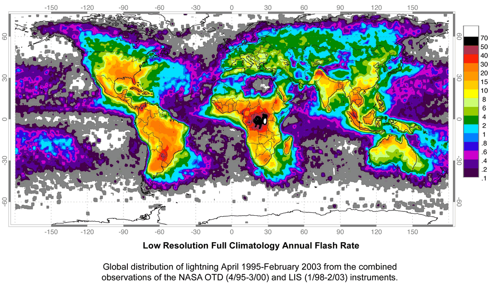
Note that there must also be a source of ignition.
Map from Geology.com. Scale bar is number of lightening flashes per square kilometer per year. Most areas of the globe have ample ignition sources.


Fire return interval can be visualized in a semi-variogram:

There are places to hide from fast, wind-driven wild fires:

Unless otherwise cited, all data from Fire and Plants by William Bond and Brian van Wilgen, 1996.